[Editor’s note: This review may contain spoilers.]
Writer: Greg Rucka
Artists: Nicola Scott & Romulo Fajardo Jr.
Summary
The Amazons must decide what to do with Steve Trevor in part two of Year One.
The Positives
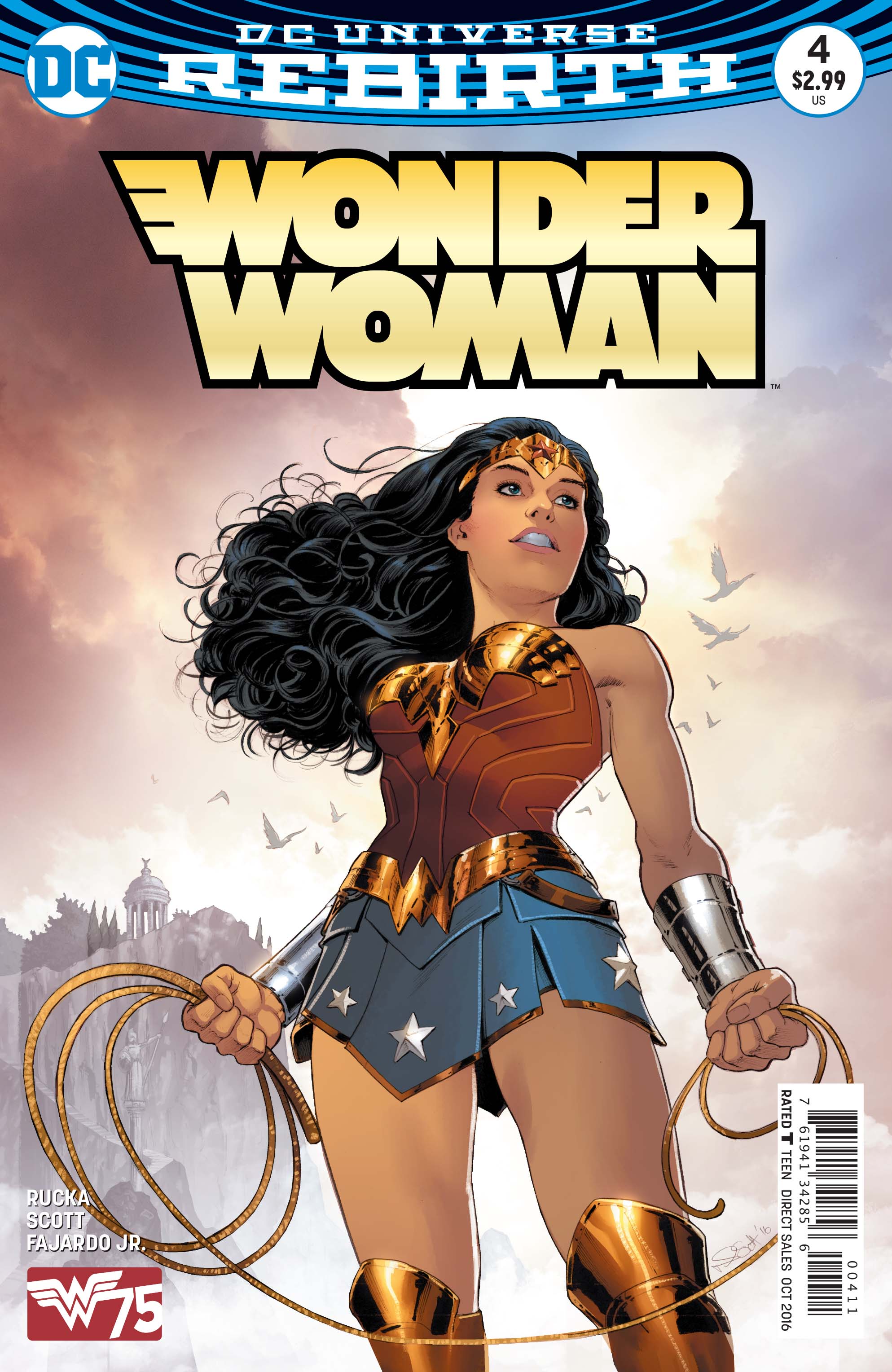
The cover by Nicola Scott and Romulo Fajardo Jr. is really cool. I like seeing a very youthful Wonder Woman; Scott does a great job of making this look like a younger version of the character we see as an adult both on the cover and in the interior artwork. I also enjoyed the background colors and Themyscira in the distance.

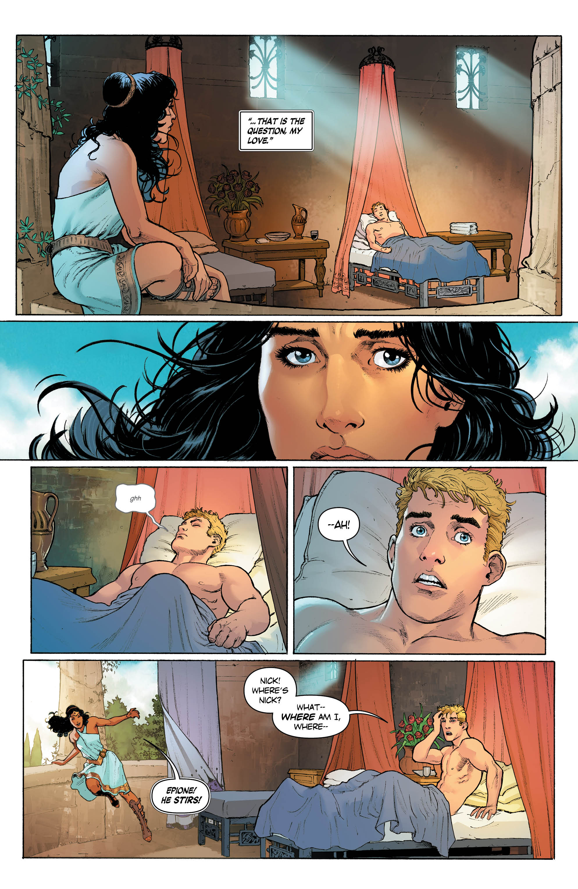
The interior art is by Scott with colors by Fajardo Jr. Both do excellent work in the issue. Scott has a particular talent for faces. The way he draws them is so expressive that every bit of emotion comes across. He shines well in a scene between Diana and Steve that I will talk about later. Fajardo Jr.’s colors are great as well. They’re vibrant and make the book pop in a fun manner.

I was somewhat weary of another Wonder Woman origin tale because we have so many different versions of that right now and I just don’t care for another iteration of this exact same story that really doesn’t change that much outside of time period. However, Greg Rucka is able to make this issue work very nicely because it has heart. There is one scene in particular in which Diana and Steve have to talk to each other but they don’t speak the same language. They can only communicate through their emotions and yet can still somewhat understand the other. It’s a rather touching scene and the highlight of the issue for me.
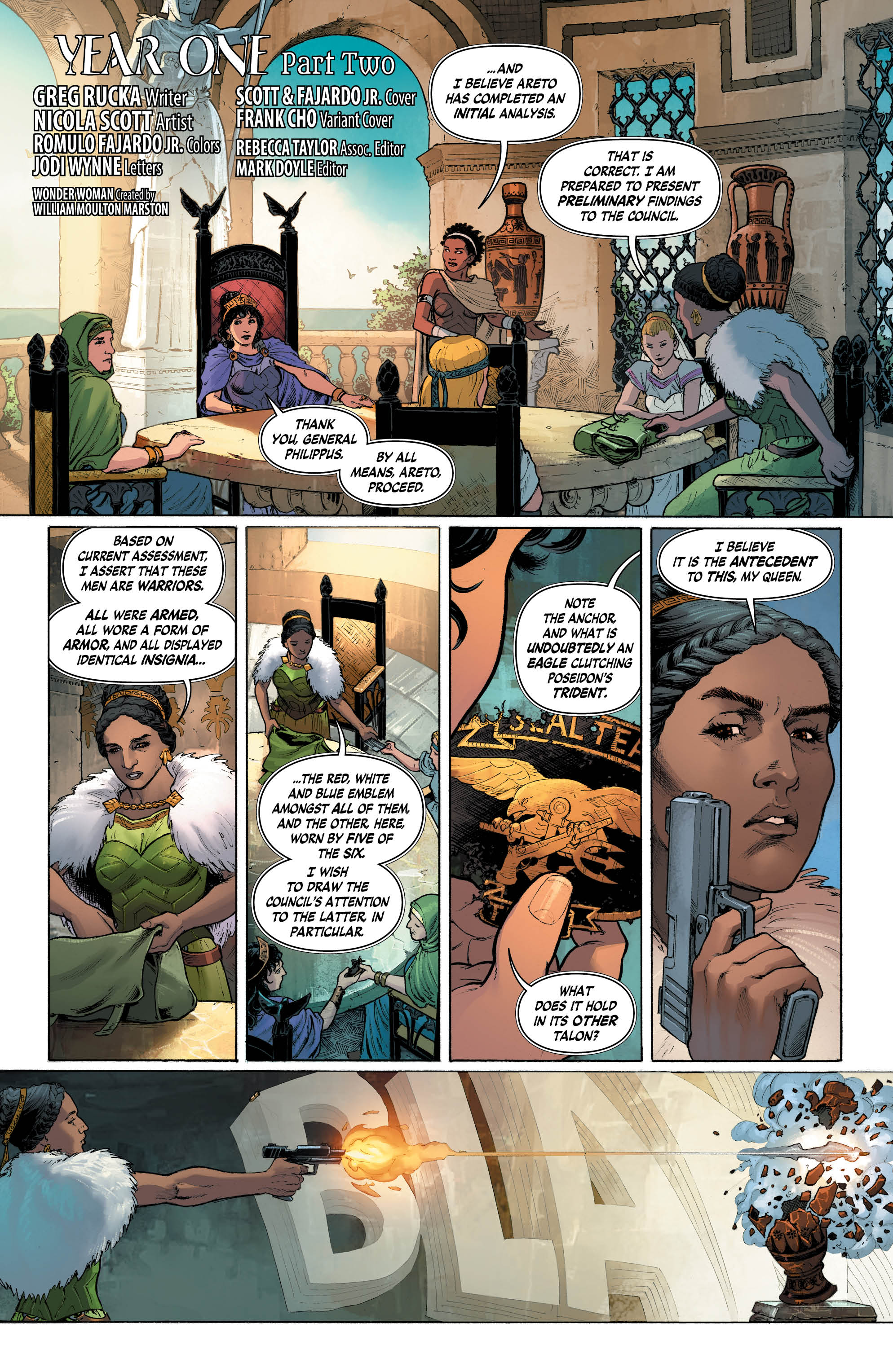
The Amazons are actually reasonable and logical here. My big complaint in Grant Morrison’s Earth One take on Wonder Woman was that the Amazons were kind of narrow minded. Here, there is an intelligence and warmth to them that is actually quite refreshing. They have natural concerns and fears about Steve but talk about it in a mature and adult manner.

The Negatives
The tournament is not the most exciting thing in this. What little we see of it is incredibly well drawn and beautiful but it’s too quick. There is no clear idea of what is going on until the last three have to block the bullets. There’s no cohesion to what we see. They look like random scenes placed together instead of a flowing action scene that moved naturally.
The Verdict
I rather enjoyed this issue. The art is beautiful but there was some heart to the story that was able to draw me in. That emotional connection really sells the issue for me. I am so tuned in with these people now that I want to see more and I was somewhat indifferent based on previous issues. I recommend checking this out. It’s a fun read.
