[Editor’s note: This review may contain spoilers]
Created by: Brian Michael Bendis & Alex Maleev
Letters: Joshua Reed
Design: Curtis King Jr.
Summary
From the creative team that brought you Daredevil and Infamous Iron Man comes the latest explosive chapter in their creator-owned epic, which IGN called one of the best comics on the stands. SCARLET tells the story of a woman whose life has been ripped apart by police corruption. When she pushes back, she starts a chain reaction of events that will bring about the next American Revolution.
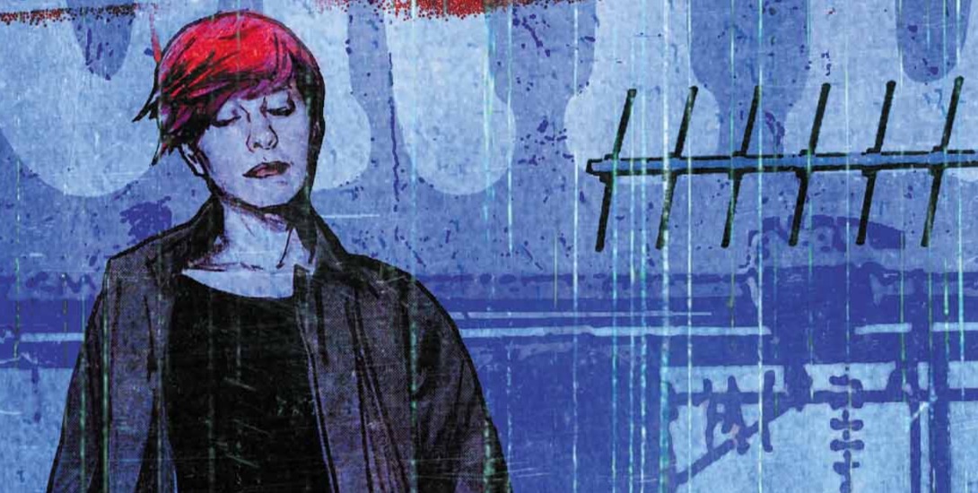
Positives
I like Alex Maleev’s cover. It’s well drawn and simple. The target symbol implies the story element of the title character being watched and that’s effective.

Maleev’s interior art is solid as well. The characters look good. And the tone and style fit the book perfectly. Without knowing anything about the plot, you can look at a page and understand the basic situation. The more muted colors help with this as well.


Negatives
There is way too much dialogue. Most of the issue is taken up by Scarlet giving an enormous speech or narrating to herself. And it tells the audience nothing. The most I got out of it was that Scarlet’s favorite movie is Charlie’s Angels followed by a clumsy attempt to draw parallels between this story and the movie Lincoln. None of this endless speech informs me of the situation which it didn’t need to because Maleev’s art already did that.
Verdict
This issue feels like padding which is strange considering it’s the first issue. The ending is the first point in which an actual plot point happens; the rest of the issue is just establishing the characters and the world. Maleev’s art does that well but the dialogue makes this issue drag and I honestly know very little about any of these characters. I understand wanting to take an issue to set up the people involved; that seems like a good idea but it’s ineffective here and the issue ends up being very dull.
