[Editor’s note: This review may contain spoilers.]
Writer: Simon Oliver
Artists: Davide Fabbri, Jose Marzan Jr., Karl Kesel & Carrie Strachan
Summary
Constantine and Mercury search for Henry’s journal.
Positives
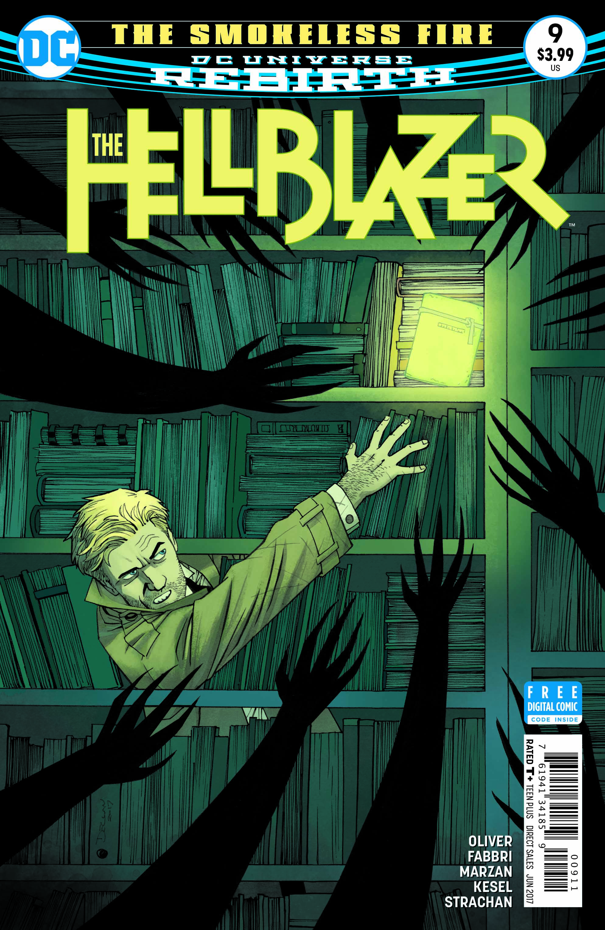
The cover by Declan Shalvey and Jordie Bellaire is great. It’s creepy but in a fun way. It’s reminiscent of older horror comics from 1950s to me. It’s atmospheric and has a nice look.

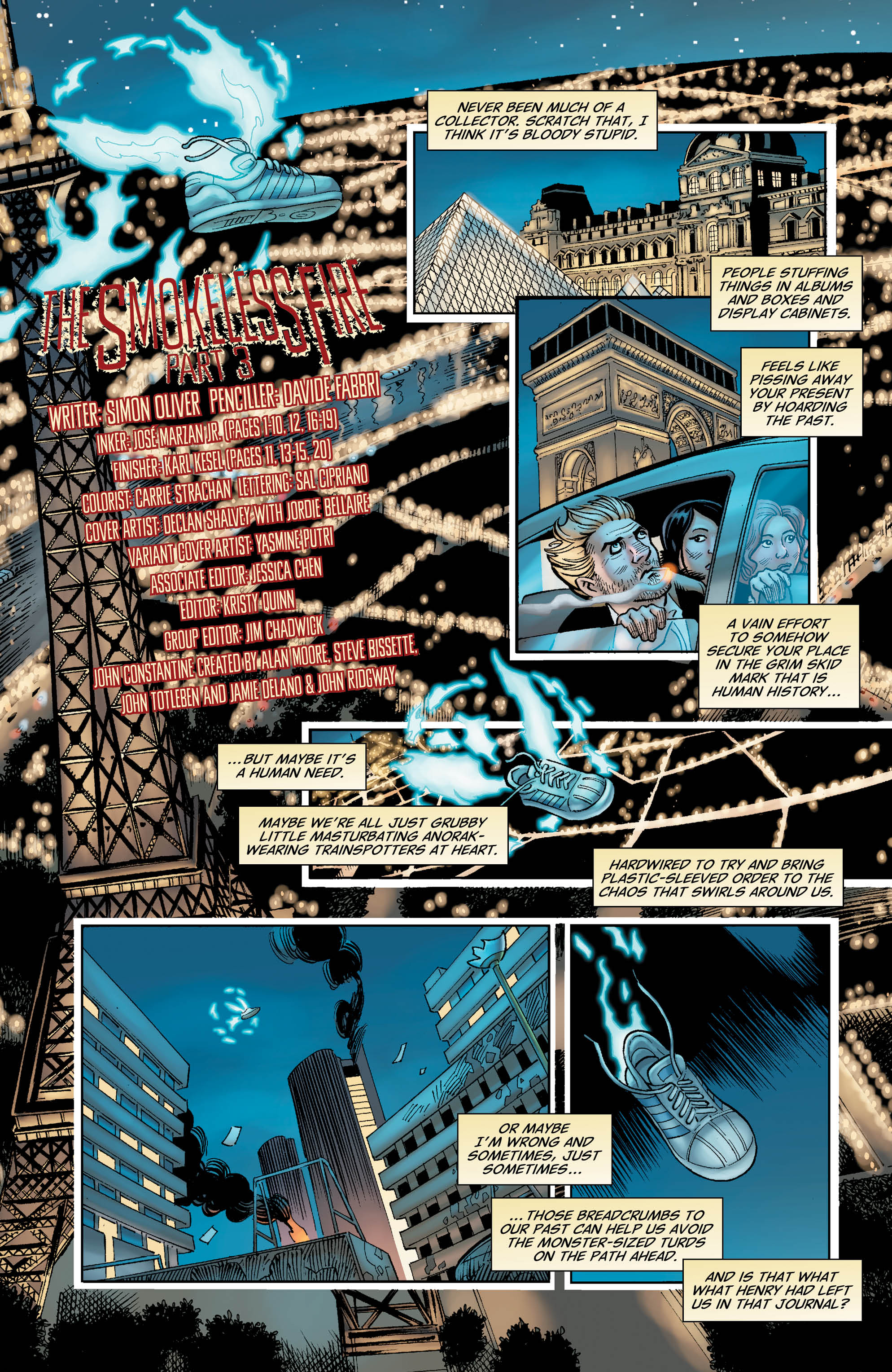
The interior art features pencils by Davide Fabbri, inks by Jose Marzan Jr. and Karl Kesel and colors by Carrie Strachan. The art is solid. The faces are distinct and expressive. There is a nice tone with the art that matches the book’s darker style. It works well.

Negatives
I think this is really dull. I honestly don’t care about anything that’s going on. None of the characters are really interesting me in any way and the plot doesn’t do anything for me either. There’s nothing technically wrong with the writing and nothing insanely stupid happens. It’s just boring to me.
I do think the book is a little over-written. There are a lot of long speeches and some unnecessary narration which make the book more of a slog to get through.
Verdict
I didn’t enjoy the issue. The art is solid but I don’t care about anything that’s happening. There is some neat imagery but nothing ever engages me in the story or characters.
