Review: BATMAN #1

[Editor’s Note: This review may contain spoilers]
Artists: Jorge Jimenez
Colours: Tomeu Morey
Letters: Clayton Cowles
Reviewed By: Derek McNeil
Summary
Batman #1: A new day dawns for the Dark Knight Detective as Eisner Award-winning writer Matt Fraction (Hawkeye, Superman’s Pal Jimmy Olsen) joins forces with superstar artist Jorge Jiménez (Batman, Summer of Superman Special) for an unforgettable new era of Batman!
The best superhero in comics gets a brand-new first issue to kick off this new era that will test Batman and Bruce Wayne like never before!
Positives
DC’s solicitations declare this reboot to be the beginning of a new era for the Batman, and it certainly seems as if this truly is a new direction for the title. The tone of the issue is a bit lighter than what you would expect from a Batman story and the look of the title is rather more colourful than you would expect from a Batman book.
I only really know Matt Fraction from his work on his Superman’s Pal, Jimmy Olsen miniseries, which had a much lighter tone than your typical comic, fully embracing the silliness of DC’s Silver and Bronze Ages. The tone in Batman #1 is nowhere as silly, but is brighter that the dark and gritty Batman we usually see in modern comics.
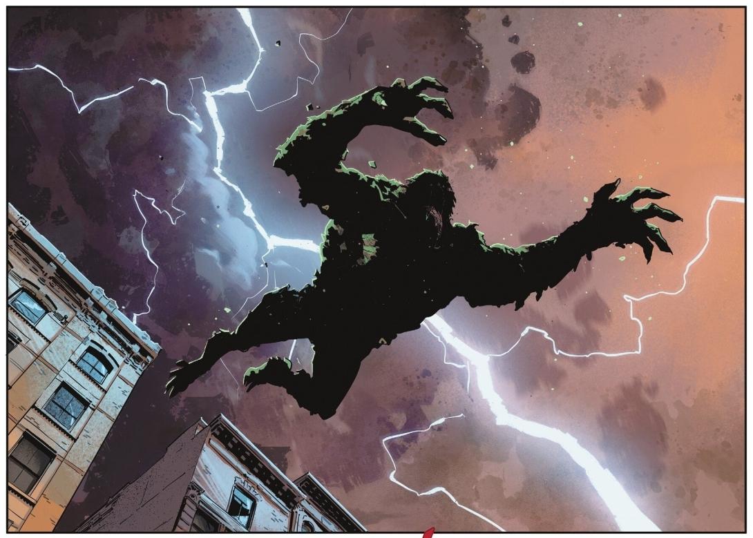
This is epitomized in the final confrontation between Batman and Croc. Realizing that Croc was currently in a child-like state, Batman forgoes the usual fight and instead removes his mask and just sits with Croc, keeping him company until Croc’s therapist shows up to take him back to Arkham. And in a touching moment, while Croc and Batman admire a life-sized dinosaur model, Bruce tells Croc, “I used to have one of these. In my house”. Of course, Bruce is referring to the famous dinosaur in the Wayne Manor Batcave.
Positives Cont.
In an interview, Fraction has stated:
“Each issue is a full beginning, middle, end, and builds as the series goes. Every issue is a new adventure, a new style, a new flavor, a new take”.
I like the idea of a series where each issue is a self-contained story. Today, many comics feature multi-issue story arcs or crossover events that span several comics. It will be a nice change of pace to see a regular one and done story where you don’t have to wait months for the story to be resolved. I look forward to seeing how Fraction implements this and whether he will eventually return to longer story arcs.
I also am intrigued by the introduction of an apparently holographic A.I. of Alfred that accompanies and advises Bruce in this issue. Presumably, only Bruce can see Alfred, as a ghostly-appearing Alfred frequently following Batman around would certainly be a big hint that Batman is really Bruce Wayne. I expect that we will learn more about this A.I. Alfred and why Bruce created him in future issues of the title.
On the artistic side I love Jorge Jimenez’s design for Batman, his new gadgets, and Gotham City itself. Batman #1 has one of the most colourful looks of a regular Batman book, at least in DC’s modern age. Breaking from the typical dark and gritty look gives this Batman title a fresh new feel.
In producing this rather colourful look, Jimenez is ably aided by the colourist, Tomeu Morey. While a colourist’s contribution to a comic is often overlooked, I usually notice and am impressed by Morey’s work.
Positives Cont.
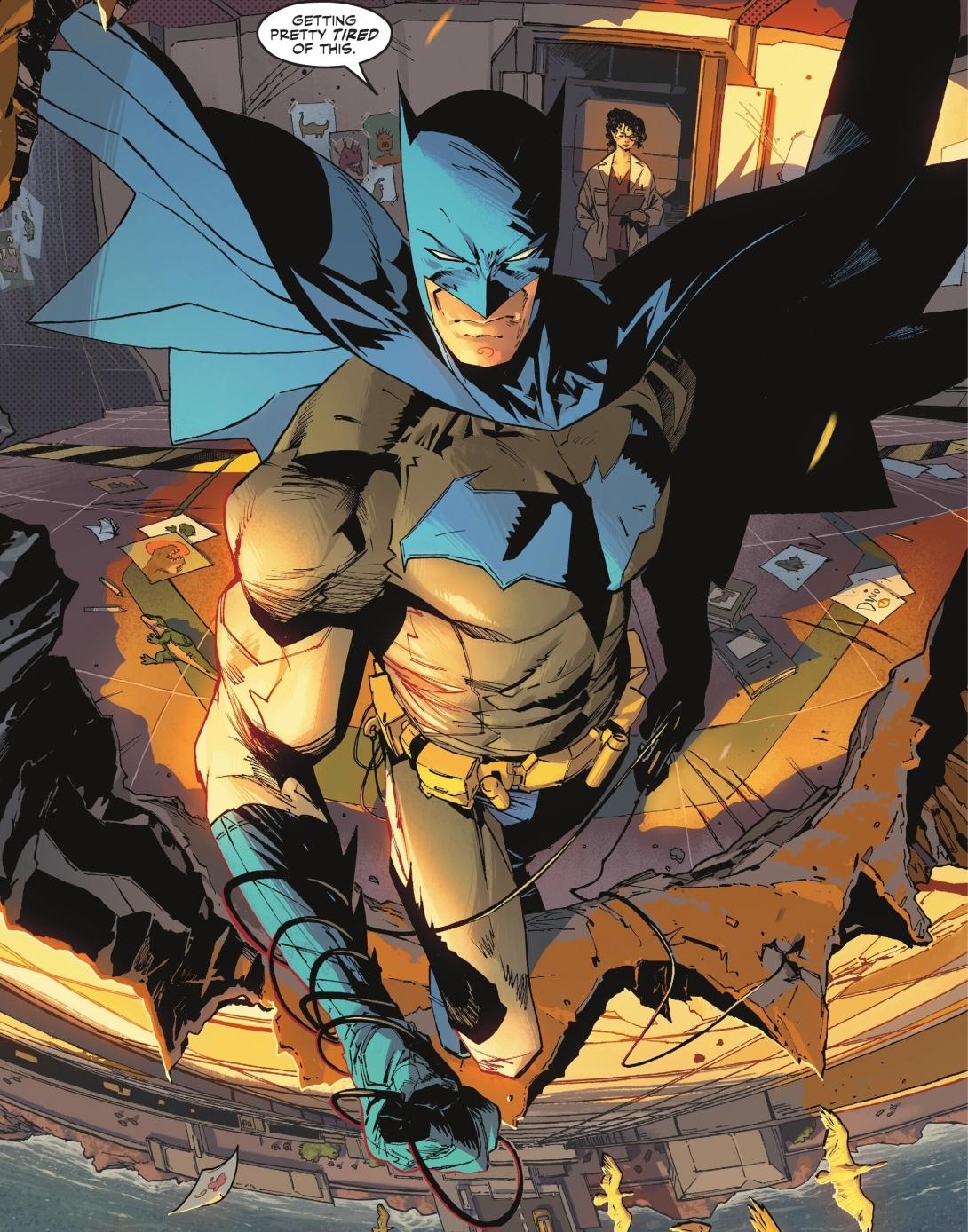
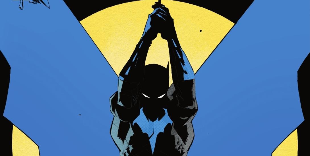
The main artistic change evident in this new Batman series is the introduction of a new and brighter blue Batsuit. Now, I think the Batsuit usually looks great, regardless of whether the cape, cowl, gloves, and boots are black or a shade of blue. However, this is quite possibly the brightest shade of blue for a main Batsuit that DC has used in years. And I regard it as a gorgeous choice.
When DC first started using darker blue and black for the Batman costume I thought it was brilliant change, but I have to admit that I find myself liking this new brighter blue look to be even better. My introduction to Batman was through 70s comics, the Super Friends cartoons, and re-runs of the Adam West TV show. So, a blue Batman costume seems to be the natural choice to me.
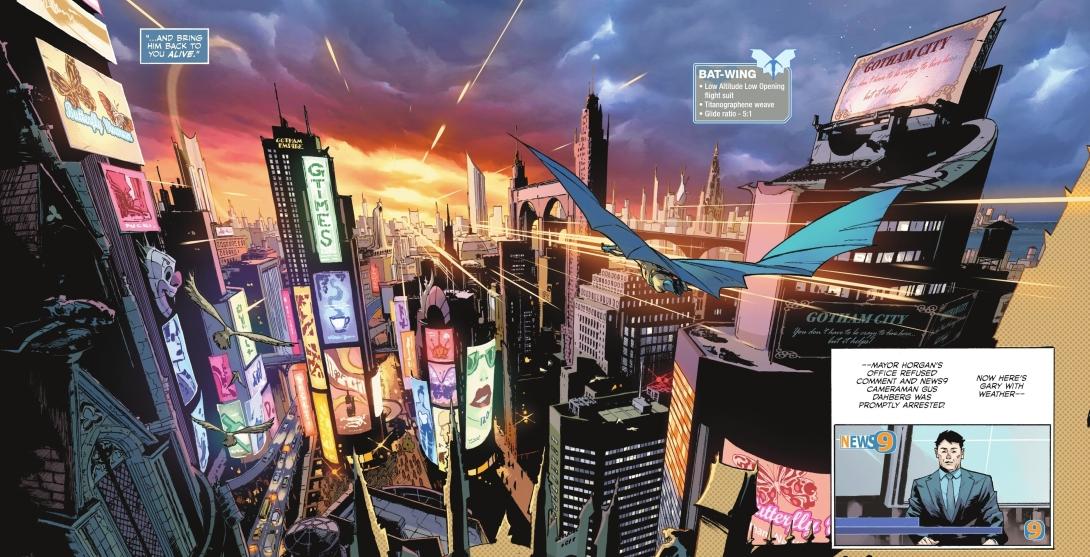
I love how Batman #1 introduces a lot of Batman’s new gadgets. There are little popup captions giving information about a gadget featured in a frame where the gadget is depicted. Thus we are introduced to the new toys that Bruce has gained since his riches have been restored.
And what we see of Jimenez’s Gotham City in Batman #1 is also colourful and surprisingly, shown in daylight. We see a the downtown core with several giant colour screens displaying advertisements, rather than dirty and dark back alleys. This gives a more nuanced and realistic view of Gotham. Most cities have rougher neighbourhoods, but also have cleaner and better kept areas as well. Also, with Vandal Savage’s strict control over the police and city government, that Gotham would appear cleaner and safer – on the surface, anyway.
Negatives
Generally, I’m not a big fan of when DC puts out an excessive amount of variant covers for an issue. I really do feel that DC is taking advantage of their customers that want to have a complete comics collection. This is also compounded by variants where comic shops have to order extreme amounts of an issue to get one copy of a rare variant. I would much prefer DC to keep their variants to a moderate number and not cause some variants to be artificially rare.
In recent years, DC has mostly beaten the completionist collector out of me. I did pick up all the non-ratio variants for this first issue. But starting with issue #2, I will only be picking up the main cover and forgo any variants except the occasional one that really catches my eye.
Negatives Cont.
However, I can give DC a bit of slack for having a few extra variants for a new Batman #1. And I do like the Giant Sized variant, which makes Jimenez’s art and Morey’s colours even easier to admire. I just hope that DC isn’t planning on making these rather expensive giant variants a regular habit, like they were doing for the H2SH story arc.
Also, I would prefer DC to use legacy numbering for their Batman title rather than artificially creating a new number one by relaunching the series. But, I do appreciate that making this a new Batman #1 will bring more attention to the title and help sell more copies. Maybe DC could use a dual numbering system that displays both the rebooted numbering and the legacy numbering.
Verdict
Batman #1 might be the most promising introductory issue for a title that I have seen in a long while. If Matt Fraction can maintain this quality of writing, this could end up being remembered as one of the definitive runs on a Batman title. And Jorge Jimenez is already showing that his artistic work is well-suited to visually realizing Fraction’s story. If this first issue is any indication, this new run of Batman has a bright future ahead.