[Editor’s note: This review may contain spoilers.]
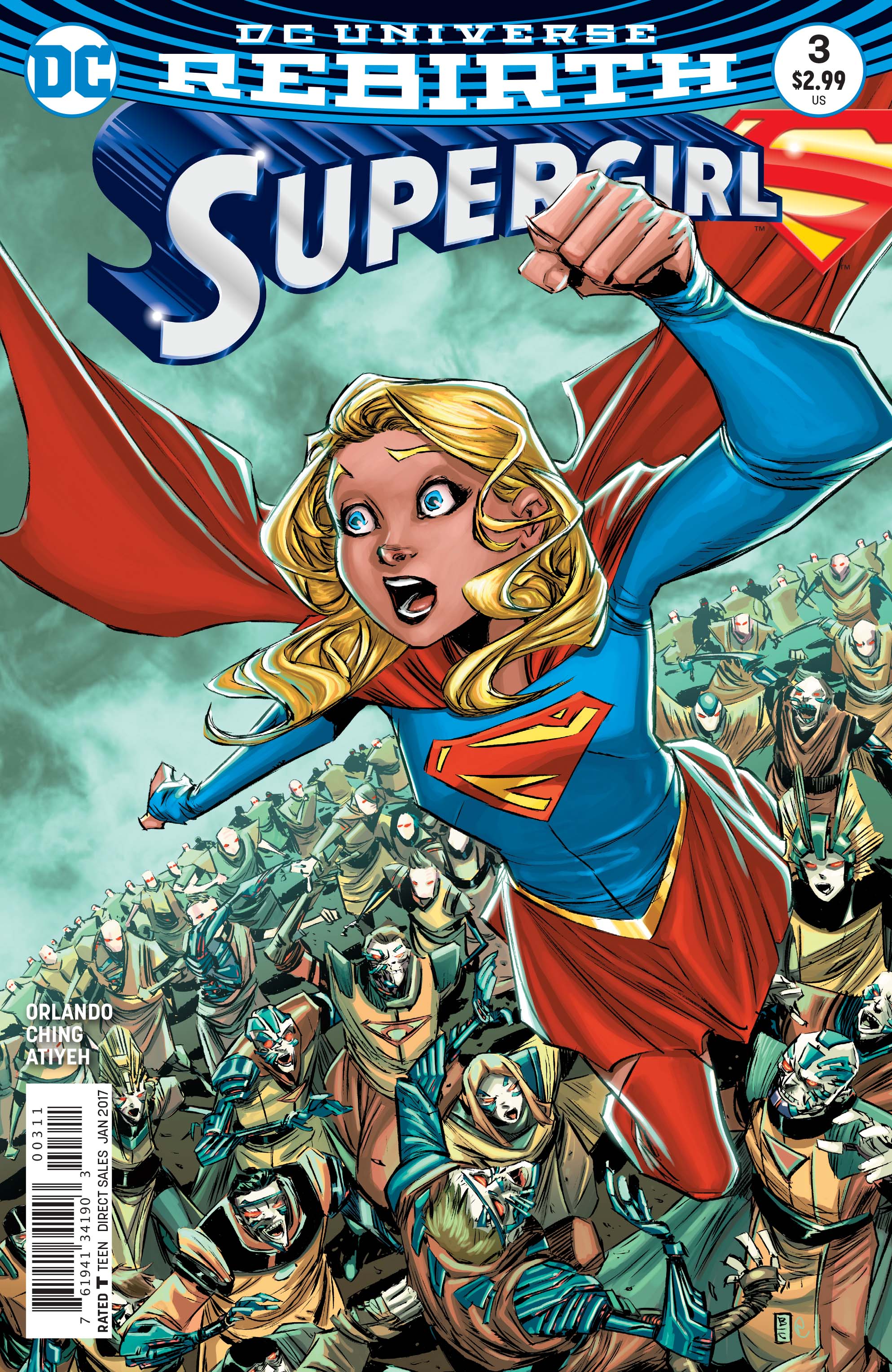
Writer: Steve Orlando
Artists: Brian Ching & Michael Atiyeh
Summary
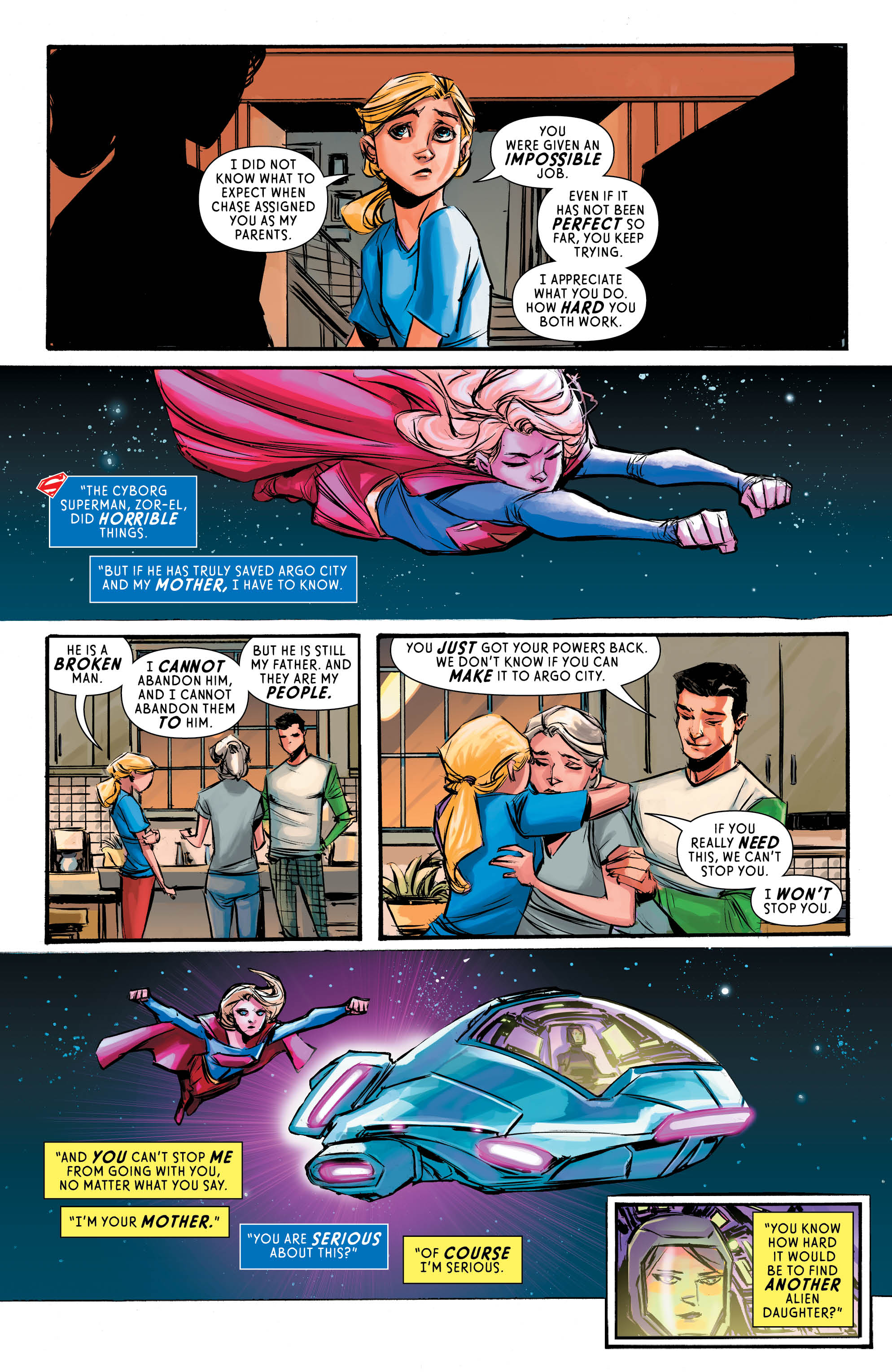
Cyborg Superman reveals his plan for Argo City to Kara.
Positives
The cover by Brian Ching and Michael Atiyeh is sufficiently creepy. An army of cyborgs going after Supergirl is a neat image. And I like the Kryptonian robes. There’s a fog both on the cover and throughout the book that gives it a cold tone which fits the cyborgs well.
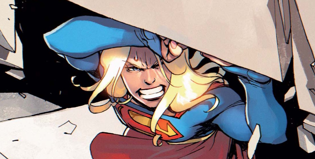
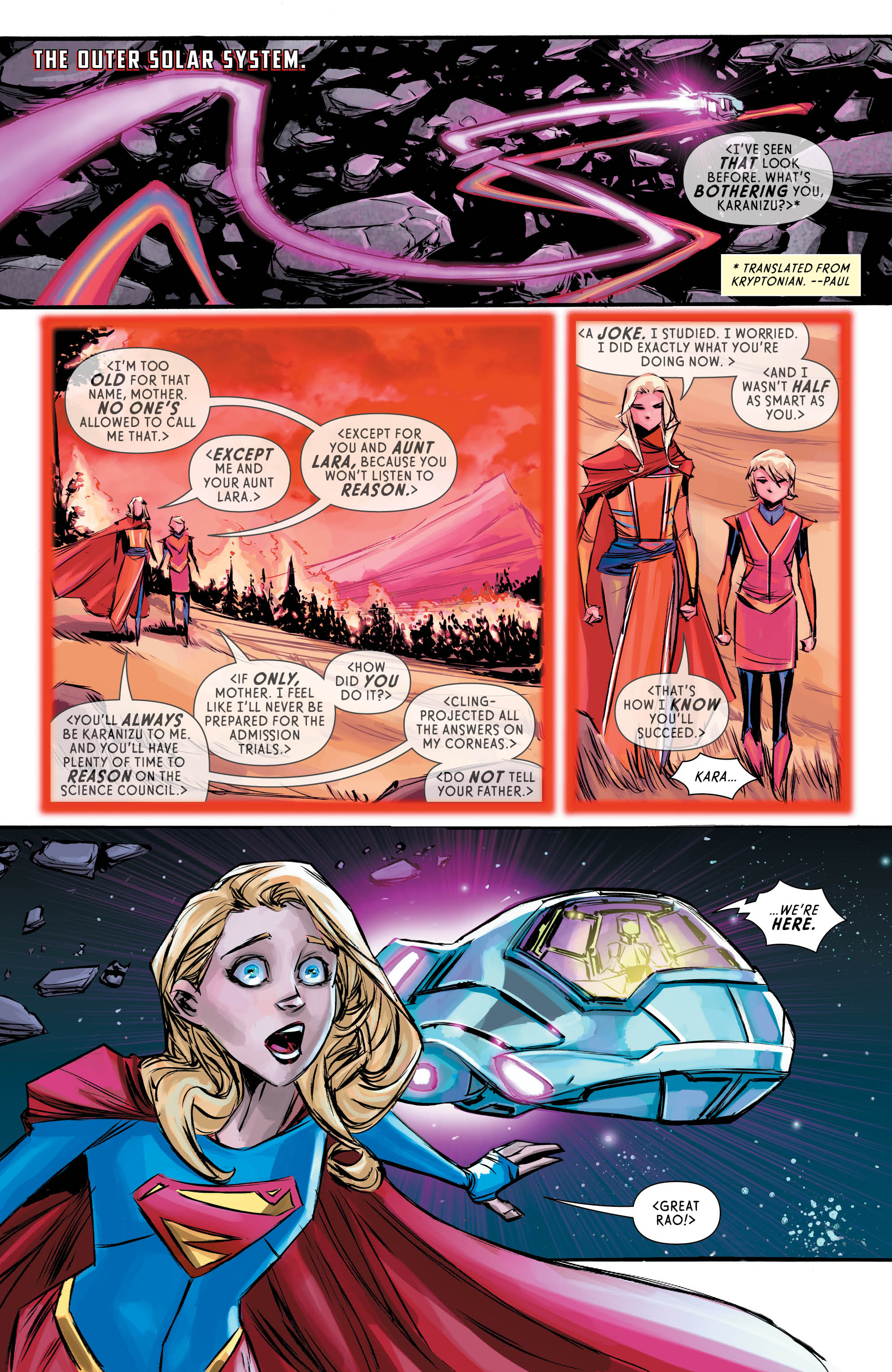
Some of the interior art is good as well. The issue is drawn by Ching with colors by Atiyeh. When the panel is tight on a character, the faces are nicely detailed and expressive which I like. I like the aesthetic of Argo City as well. Atiyeh’s coloring throughout is solid and matches the tone.
I like what Cyborg Superman is doing. His plan to resurrect Argo City is bizarre and creepy but it is what Kara wants. It’s a perversion of her wish but she would want nothing more than for her parents to be back and she could leave Earth. I like that she has an opportunity to do that but there is a catch. It’s not exactly what she wanted because the universe isn’t perfect and we don’t always get what we want. And it never ends well when people try to manipulate the situation to be exactly what they want. Steve Orlando’s script here is pretty strong.
Negatives
While I like the cover, my main gripe with it is Kara’s face and the same can be said for some of the interior art. While I love how expressive it is, her face looks too young. Both on the cover and in the early pages, she looks 12. Once she puts the Supergirl outfit on, she looks like she’s in her late teens again. But the conversation between Kara and the Danvers is bizarre because of the art. I’m not sure why she looks that way.
As I said earlier, some of the art is good. Some of it is not in my opinion. While the faces are nicely done when the panel is a tight shot, the faces are not as good when the panel depicts characters as further away. The further away characters are, the weirder their faces get. There are lot of panels where faces are simply blobs with black dots. Sometimes mouths are there and sometimes mouths are vague lines. There’s one panel in which Kara does not have eyes or a mouth. It’s a strange stylistic choice that does not work for me at all.
There are brief interludes with Director Chase and Cat Grant that I found unnecessary. They’re quick scenes and certainly not obnoxious. But, I think this issue would benefit more from focusing on the Cyborg Superman plot. These other scenes felt like distractions that I didn’t want.
Verdict
While there are some things that I like about this issue, there is a lot I don’t like about it. The main thing that bothers me is the art. Some of it works well but the parts that don’t really bug me and take me out of the story. Said story is pretty good and there’s solid characterization for Kara as always. The tone and mood work well and there are some wonderful panels. But the panels that bother me take a lot out of this story and stop my enjoyment. I don’t recommend reading this issue.
