[Editor’s note: This review may contain spoilers]
Writer: Mairghread Scott
Artists: Paul Pelletier & Norm Rapmund
Colors: Jordie Bellaire
Letters: Deron Bennett
Summary
You can’t go home again. But that’s just where Barbara Gordon, a.k.a. Batgirl, is forced to go when the chip granting her mobility keeps shorting out in the aftermath of her clash with Grotesque. Will Commissioner Gordon drive Babs totally bonkers with his bedside manner? Or will the malfunctioning tech impact more than just her legs? Plus, what’s the deal with killer art critic Grotesque and his murderous new M.O.? It’s all in part two of “Art of the Crime.”
Positives
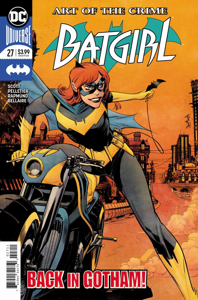
The cover by Sean Murphy and Matt Hollingsworth is fine. It is stylized and a cool vibe to it.
The interior art is solid. The team is able to bring in a surreal tone when the issue requires it that is very effective and interesting. Additionally, a lot of the art is fairly standard which both helps the weirder stuff stand out and tricks the reader into a false sense of comfort as Babs is potentially losing her mind.
The issue feels somewhat like a mission statement and presents what Mairghread Scott wants Batgirl to be. This is a story of a victim desperately trying to reclaim herself and prove that she is strong. There’s a strong moment in which it’s suggested that maybe Commissioner Gordon feels shame over her injury and that negatively affects Barbara.

Negatives
While I think it’s well written and there is some solid character work for Babs, I am a little over Killing Joke. It’s so strange that this one story has defined this character’s existence and motivations even 30 years later. It is an important story to tell; her recovery both as Oracle and as Batgirl matters. But I feel that it is an overused idea. It is strange that so many stories focus on Babs moving on from the attack but we never really do.
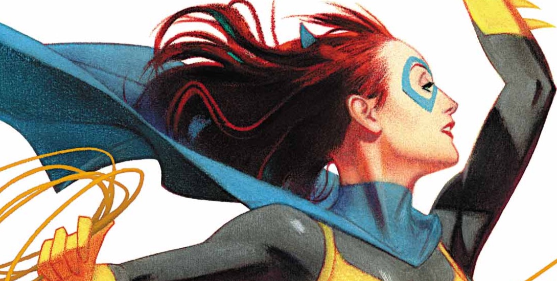
I’m not in love with the new costume. It’s just personal tastes and preferences. I like Babs wearing purple; I’ve never liked the blue and grey look. I think purple gives her a bit more of a unique visual presentation. And I wish she had a cowl.
Verdict
This issue is solid. It’s well written and the art is really good. For me, dealing with the Killing Joke fallout again is a little tedious but it is so well handled by Scott that it is not a huge determent from the issue. It’s worth checking out.
