ARTIST PROFILE: Neal Adams
Written by Peter Gaudioso
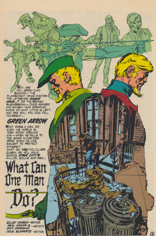
What Can One Man Do?
Allot! Writer, interior penciller, cover artist – Neal Adams is a much a super hero as those he draws. Time travel with me through an impressive gallery of the works of a comic book industry legend.

A Gentleman’s Handshake.
Neal Adams, born June 15, 1941, is the stuff of legend. With history unfolding all around him Adams rose to the occasion and illustrated some of the greats. I can’t fathom a modern day equivalent of the above pairing. Who could compare to these globally adored icons? Look at how perfectly Adams captured Muhammad Ali’s face. Also the subtle difference between the musculature of a champion boxer and that of planet Earth’s most powerful man. This isn’t your average posturing either. Both heroes are equally relaxed and inspired. Work like this shows that Neal is easily the pop illustrator of the century.
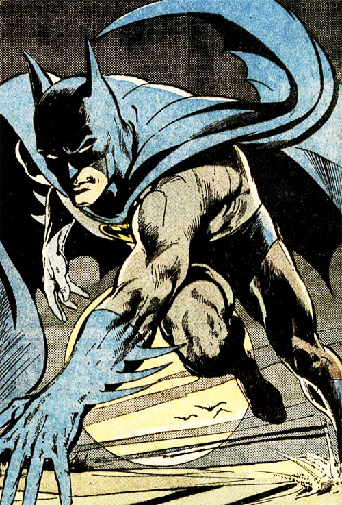
Batman – The Artist’s Standard
Here is Neal’s first Crack at the Dark Knight. The_Brave_and_the_Bold #79 gives us a different hero for a different Era. A tad less brooding, perhaps, this Batman is the pure embodiment of speed. No offense to our modern, perpetually traumatized Bruce Wayne. Imagine how difficult it is to create swiftness that can be felt surging off the page. A draft lifts the arc of his cape as Batman pushes away from the streaking clouds behind. Every scene Neal Adams presents is infused with a subliminal explanation point!
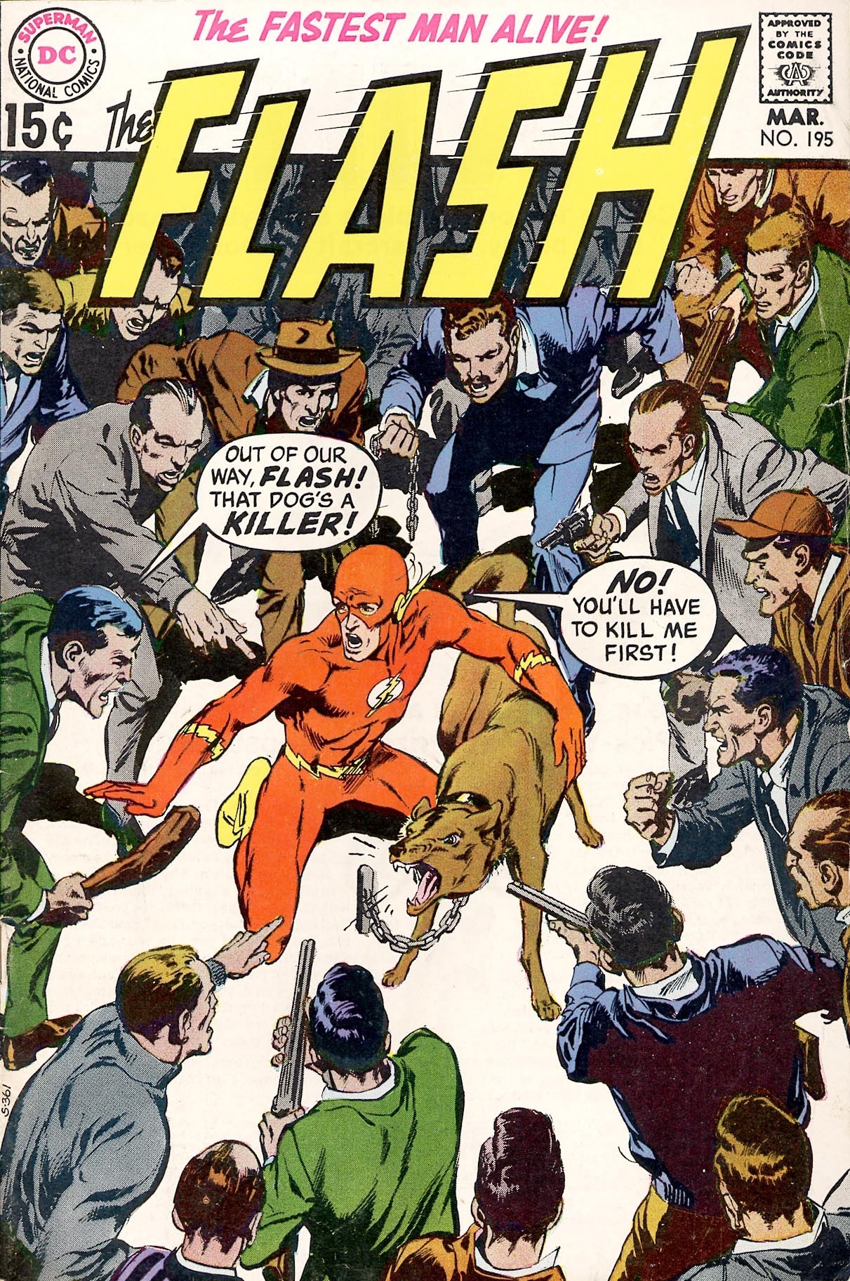
Hot Off The Press!
The 1970’s comic book covers were so different than those of today. The ever-constant dialogue bubbles, the newspaper looking print, a limited color palette. Yet, Neal Adams truly flourished in this decade. Look at all of the variations of poses distributed among this “working man’s” mob. Follow around this clockwork composition and you’ll notice each figure is turned at an ever-so-slightly different angle than the previous. Of course all eyes are on the Flash, but NA spent an equal amount of time on the lot.
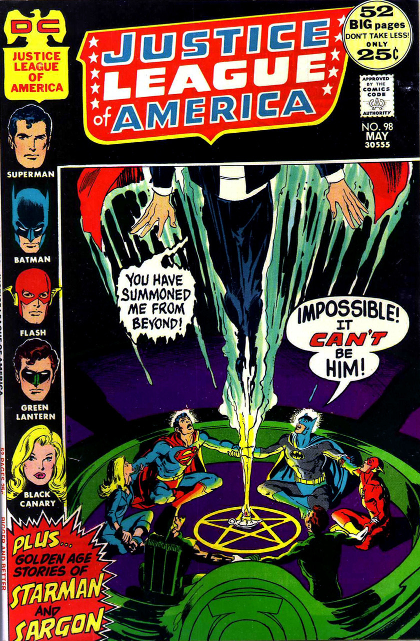
The Devil Is In The Details
Question: can an image be simple and complex at the same time? Yes. Even though this cover for Justice League of America is a bit over saturated with dark ink, the shadows are packed with clues. The hidden face of the team’s adversary has my curiosity peaked. Our super team seated withing the Green Lantern’s Ring also has mysterious portents. (The fact that Superman is resorting to using black magic is a whole other issue.)

Super-Simplicity!
Every now and again Neal Adams will hit you with a Mike Tyson knockout punch! We have seen NA excel in secret details and perfectly executed anatomy but sometimes a story just needs a meat and potatoes cover. As you can see here, the pitch is unavoidable: Superman is no longer weakened by Kryptonite!? I can forgive the sparse background and mediocre title lettering because Superman is huge! Nothing else is important besides him and those shattering chains. What Earthing could resist delving into this tempting plot?
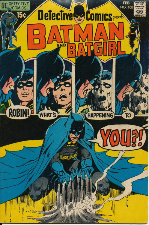
That WOW Factor!
Here is another eye opener – and tear jerker. The emotional magnetism this cover generates is more like a tractor beam. Creating more of a classic horror feel, NA shines once again with his use of strong facial expressions and unique framing. For a cover artist, giving the reader a sense that there are visceral consequences ahead is an absolute necessity.

Art To Make You Feel Good
Rediscovering Neal Adams offers us a time capsule into an America with a slightly different value system. This lighthearted and joyous image suggests a wholesome, family oriented feeling. Society appreciates it’s artists most in times of duress or in times of celebration. This is when high art manifests, with great purpose. Sending a positive and uplifting message is the artists most noble privilege. Bravo, Neal. Thank you for your legacy of inspiration.
I hope you enjoyed this miniscule glimpse into the genius of Neal Adams. Less biographical, the DC ARTIST PROFILE series concentrates more on style, personality and artistic composition. If there is an artist you would like for me to critique, please leave their name in the comments below.