[Editor’s Note: This review may contain spoilers]
Writer: Warren Ellis
Artists: Jon Davis-Hunt, Steve Buccellato
Summary
Jacob’s team inches closer to their attack on IO Hightower. What was once a covert mission for Cole and Kenesha is starting to look a lot more explosive. Meanwhile, Jenny learns a little more about who she is from the Doctor. Along the way new characters are introduced and there’s a real sense that a war is approaching.
Positives
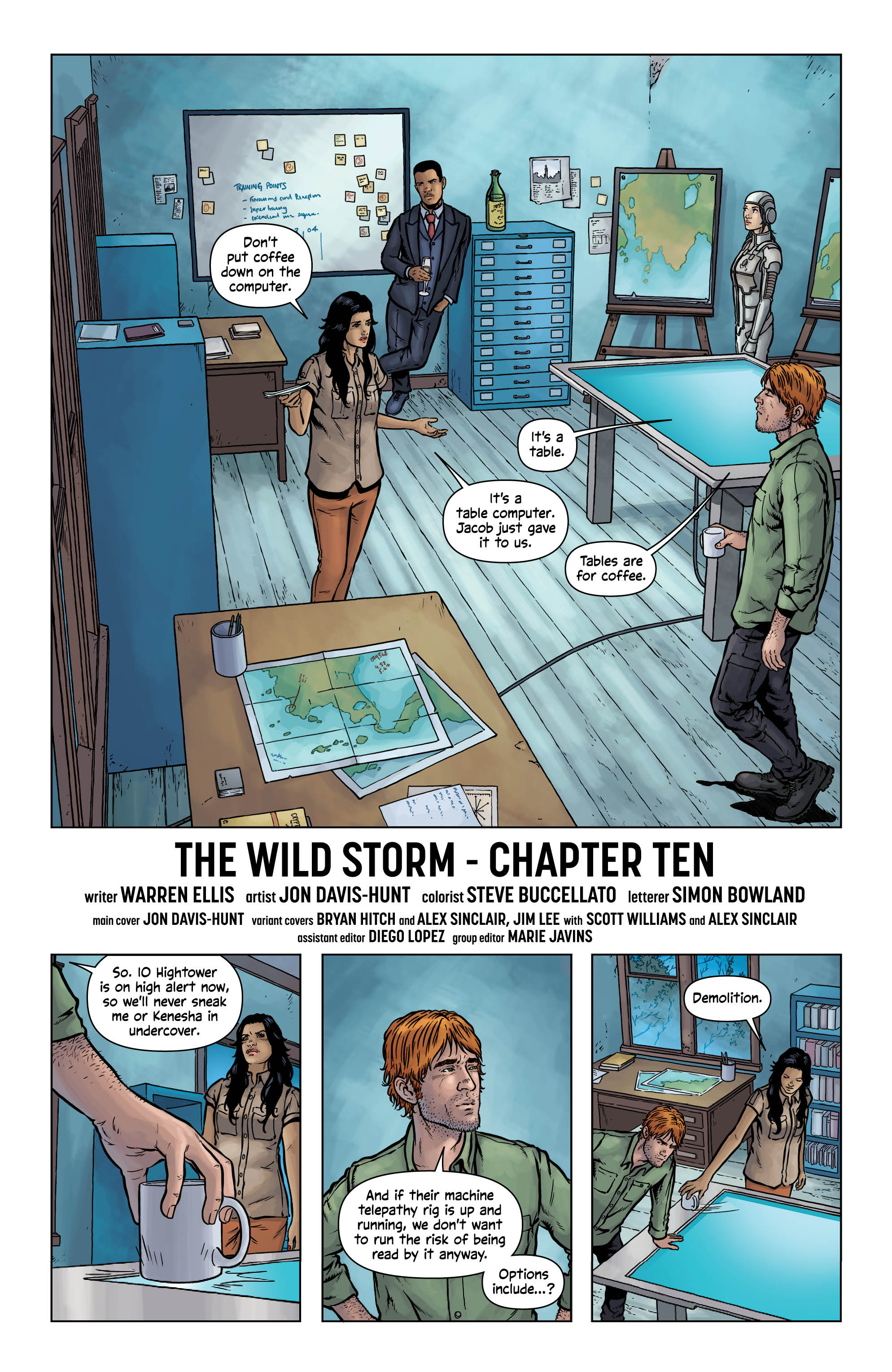
The team of Davis-Hunt and Buccellato are incomparable. Every month they continue to impress. With this issue plot wise, not much happens (as I will touch on) and yet somehow the two still deliver some of the best artwork in comic books today. The splash pages of the series stand out as some of the best. It’s become a trope of the series now that each issue has one silent splash page and part of the fun of reading each issue is finding it. What I really like about the artwork is how Davis-Hunt and Buccellato can make anything exciting. For example, this month’s splash page is of Henry standing above his workers on the space station. Technically it’s just Henry standing after pages of dialogue. There’s no real build or payoff, it just appears at the end of the scene. But the perspective is so amazing, and the detail intricate, that the reader has no choice but to marvel at the skill of the two artists.
Likewise, when not producing a splash page, Davis-Hunt can make any page interesting. This series has some of the most unique panel layouts of late. There are some conventional 3×3 panel pages but also some 3×2 with square panels down one side and widescreen panels down the other. It helps to make the numerous conversational scenes much more interesting to read. I’m not sure how much of the layout is Ellis’s idea but Davis-Hunt definitely plays with the script to create some interesting pages.
Negatives
Now, while I enjoyed the issue it wasn’t without it’s faults. This issue more than any that preceded it, felt very much like a filler issue. Throughout there’s a sense that something’s coming, but at no point did I feel that ‘something’ would be this issue. Personally that’s a problem, because a reader should be enticed to turn each page, not wait each month. There’s a lot to enjoy from the issue, like the artwork I’ve already talked about, but unless you really love dialogue this issue won’t do much for you. Each section of the issue is just characters planning their next move. Luckily Ellis is a master writer so it’s still quite entertaining, but it’s worth knowing that that’s all this issue is.
On the topic of dialogue there were a couple moments that jumped out to me. The opening scene has some cringe worthy dialogue that made me double check the writer’s credit. I’m not sure why Kenesha suddenly talks like a child but with so much going on in this series it’s always possible I missed something. Additionally Henry’s dialogue is so meta I’m beginning to wonder if Ellis is changing the series into a comedy. It’s amusing but it didn’t fit with the tone the rest of the issue had set.
Verdict
In all, this is a fairly generic issue filled to the brim with conversations about doing things but with very little doing. Readers need to read the issue just to stay connected with the series at this stage but most of the entertainment found here is from the masterful artwork delivered by Jon Davis-Hunt and Steve Buccellato.


