[Editor’s Note: This review may contain spoilers.]
Writer: Benjamin Percy
Artist: Juan Ferreyra
Summary
Green Arrow, Black Canary and Diggle board a diplomatic train that is carrying an assassin.
Positives
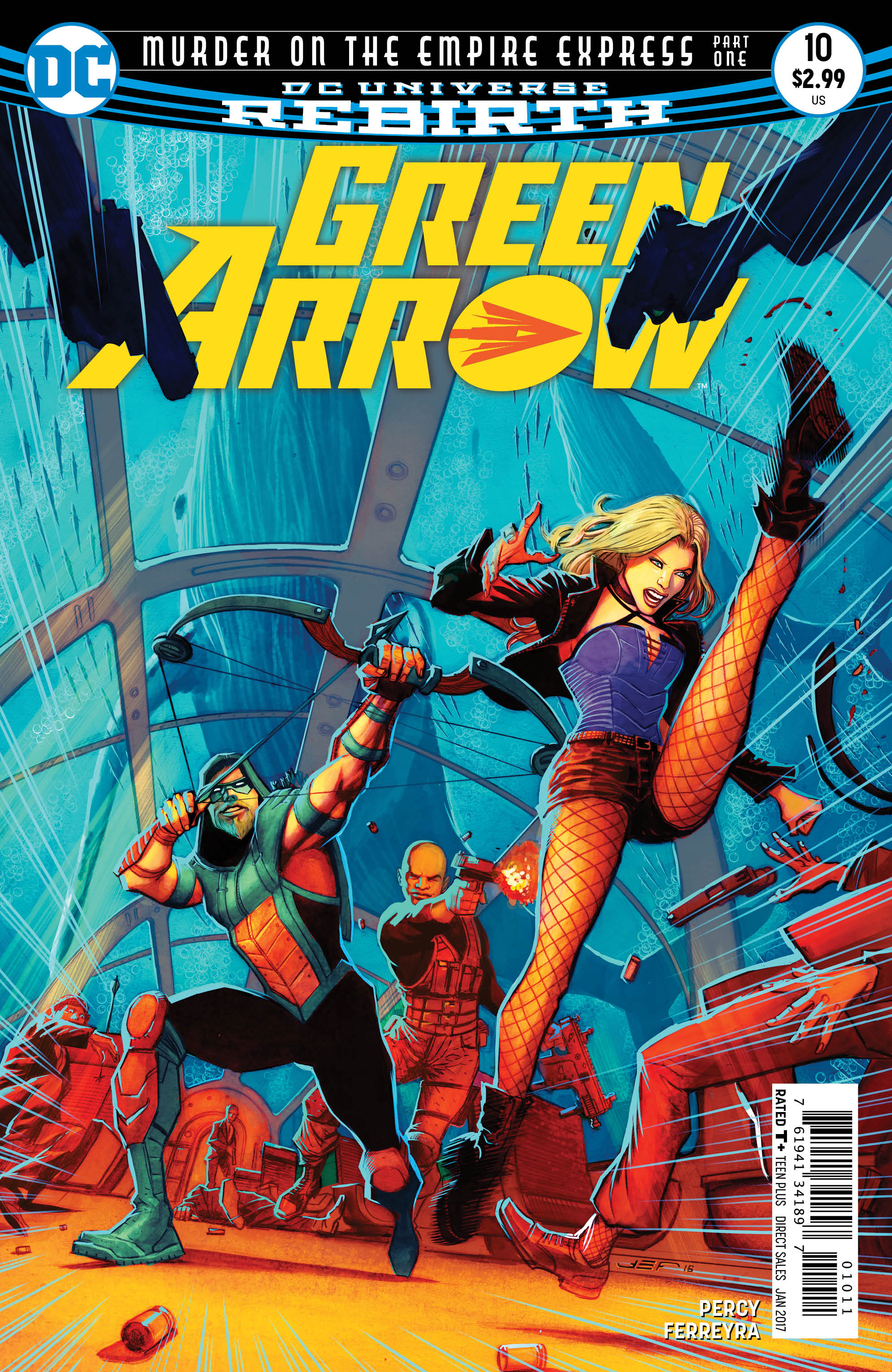
I love this cover by Juan Ferreyra. It’s a nice dynamic action pose with the added thrill of seeing Green Arrow and Black Canary side by side. I know we’ve seen that a lot with this series but it’s cool every time. I also like how Ferreyra adds in the lines to demonstrate the speed of the train. It’s a nice touch.
The interior art by Ferreyra is equally good. I am in love with his coloring. Ferreyra uses the concept of an underwater train to his advantage and creates a nice mood with the water. My favorite part of the book is a splash page in which Black Canary uses her canary cry. First, I love that the color scheme changes. But it’s also an amazing image. I hope Ferreyra sells prints of this piece or something similar because I would love to have that image on my wall.
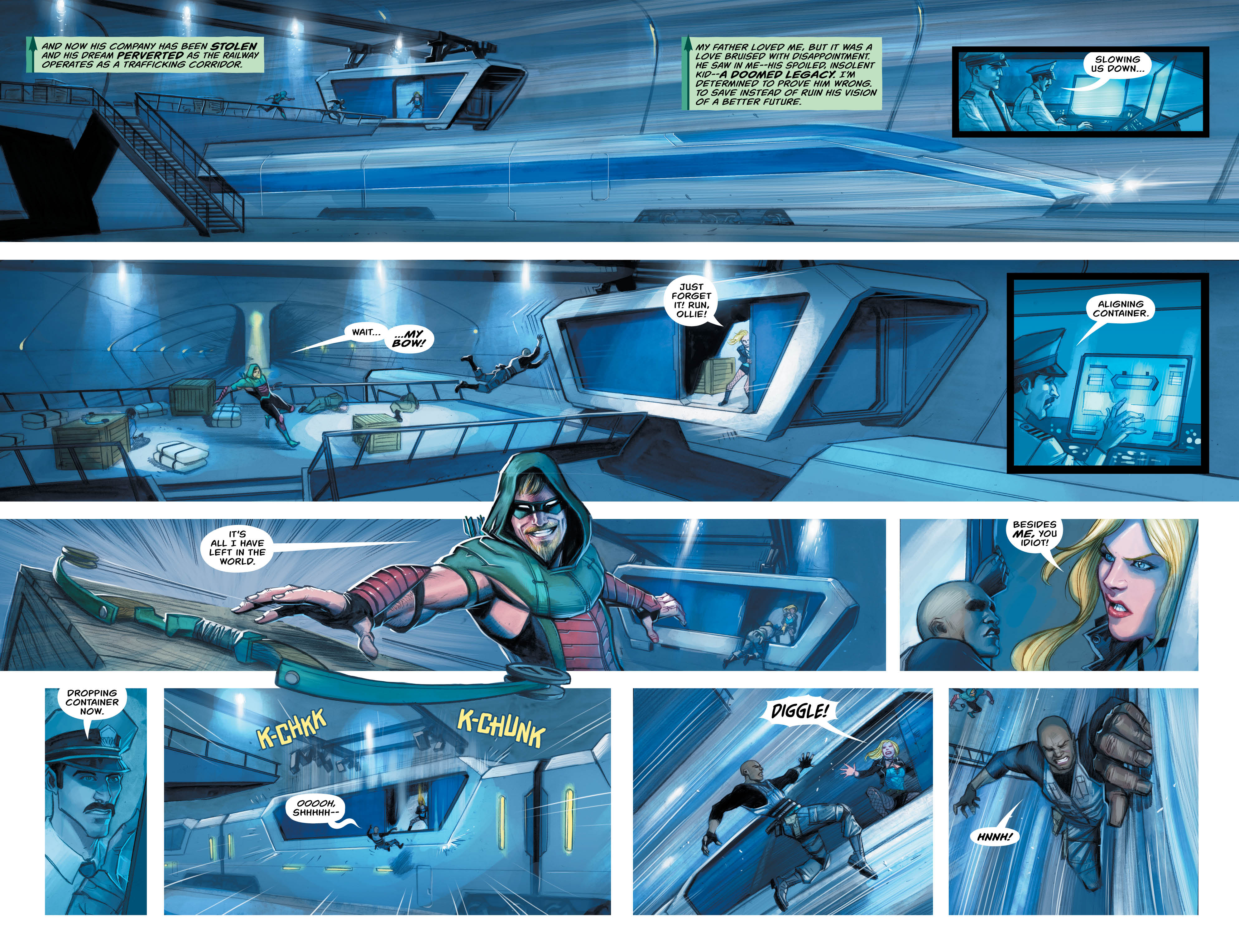
I like the concept of an assassin on a train but Benjamin Percy is able to take it up a notch and put the train underwater. This would be a terrific idea for a horror film. No one can get off the train because it’s underwater and they’ll drown. That added element of danger is exciting; I hope he plays with it a bit more next issue. I also like that the team gets split up and figures out part of the mystery on their own. While they work better as a team, they’re still great as independent heroes and I like seeing that.
The boxing glove arrow is always cool. And no one can convince me otherwise.
The assassin is a familiar face to both fans of the comics and the television show. I won’t ruin it but it was a nice surprise. I like that more of Green Arrow’s world is being brought into this run.
Negatives
I only have one complaint about the art and it’s on the last page. Black Canary is in an awkward and unnatural pose that I just don’t like. She’s twisting her body around in a weird fashion and her legs are impossibly far apart. I understand that it’s a comic and not everything is going to look realistic; I certainly don’t want it to. But Dinah’s pose is strange and I don’t like it. Everything else about the art is wonderful.
Verdict
Overall, this is a fun issue. It has a great concept by Percy with some cool moments for all three characters to shine. And the art is fantastic especially the coloring. I recommend reading this issue.
