[Editor’s Note: This review may contain spoilers]
Writer: Brian Michael Bendis
Artist: David Mack
Summary
Things get even more confusing for Max Field as he finds himself further entrenched in a world of espionage. Field travels to Istanbul on a mission given to him by the mysterious Julia. Thanks to some non linear story telling however, readers know that something will go wrong for him eventually.
Positives
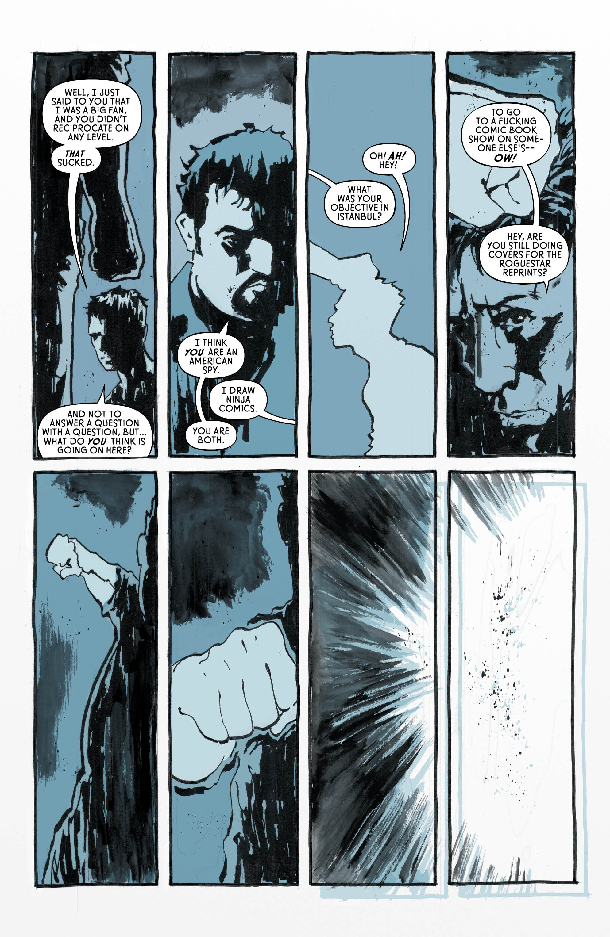
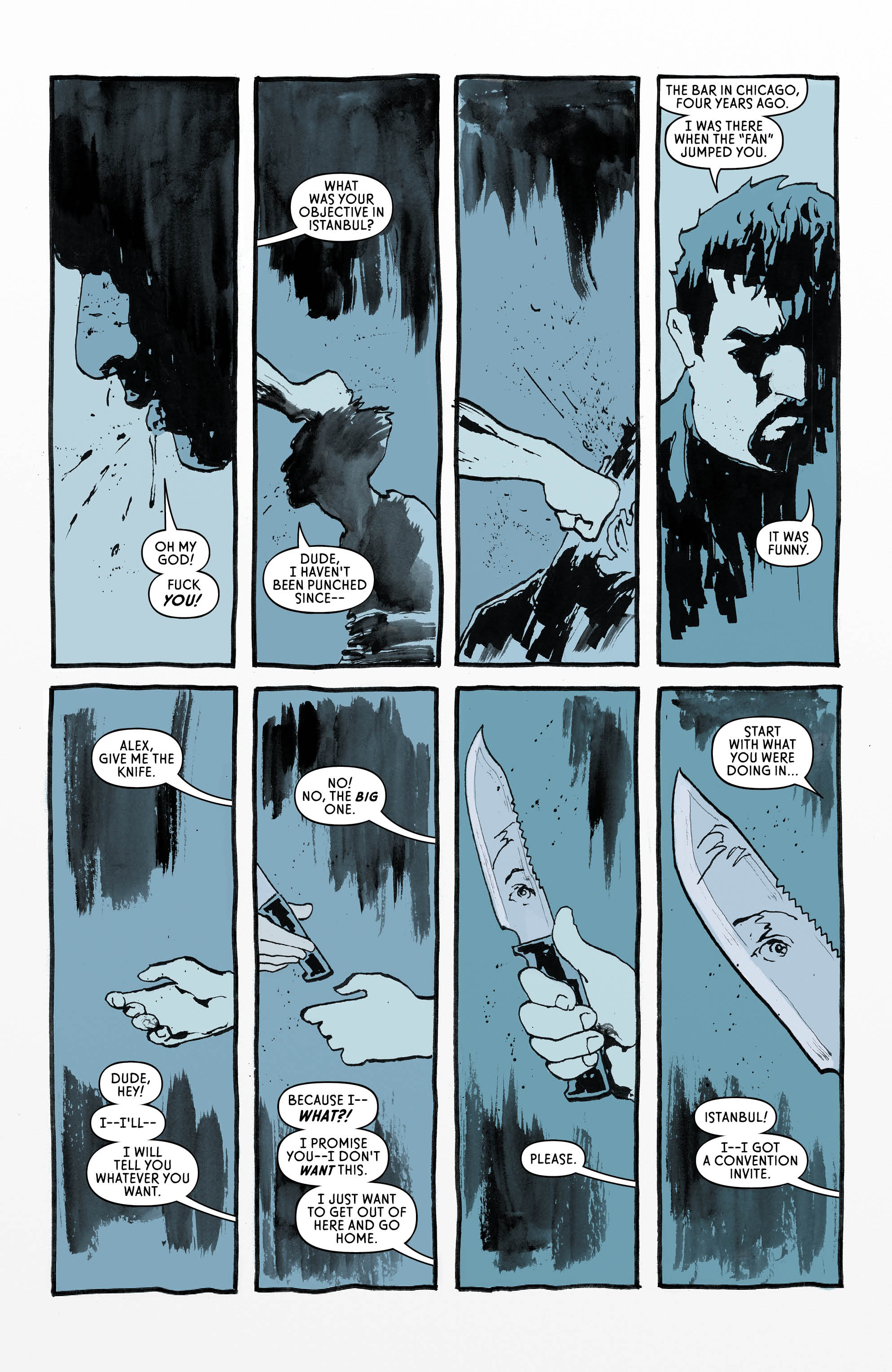
To say the art carries this book is an understatement. At times it feels like a David Mack art book that’s just accompanied by some words by Brian Michael Bendis. Every single page is beautiful and worthy of framing as is. In fact the silent pages are among the best due to the fact they let readers just bask in the artwork. The changing colouring style stands out as a key component of the series and just adds another reason to pick it up.
Mack alternates between digital colouring and watercolours, depending on the time the story is set in. The colours also get much more vibrant and free when Julia is on the page, thanks to the watercolours. This gives the book some much needed depth that unfortunately is missing from the dialogue and plot. The segments of Max Field’s own story within the book are just an excuse or Mack to show off with genuinely striking works of art. It’s just a shame that Mack has to include the silhouette of Field in some of these pages.
Plot wise the story is adequate. Enough happens to justify readers’ interest and Bendis is crafting a fairly competent thriller. His pace is notoriously slow and at times (five page dialogue scenes that reuse panels for example) it’s noticeable that he is taking his time when he could be adding just a little more intrigue into the story.
Negatives
It’s a shame to say that the book has its issues. While the story is engaging and the artwork phenomenal, there are so many smaller problems throughout this issue alone that build some worry towards this series as a whole.
Firstly the ‘Bendis dialogue’ is in full effect here. Bendis likes his dialogue sequences. At times they work, at others you get four full pages of dialogue that feature word balloons with a word each so as to pad out the sequence. It doesn’t always make the dialogue more realistic to include an obnoxious number of “yup” “uh-huh” and “okay, cool” word balloons. With writing so disappointing next to the wonderful artwork it feels like the story struggles to justify itself to Mack’s contributions.
From there if reusing panels is something that irks you then this issue in particular will be a trying experience. In television characters will typically move every so often to break the stillness of two characters having an extended conversation. That’s why couples fight from room to room in their home, or people drink coffee on dates in television. While television and comics are obviously different, without any movement this issue has extended sequences that feel as if time has been frozen. That effect works well when Julia is emphasised but during regular dialogue segments it feels boring. Everyone just sits and talks, occasionally moving their head to the left or right.
Verdict
Cover #2 is a strange one. At times stunningly beautiful. At others painfully slow. But underneath the faults is a strong thriller that hopefully will come out to shine eventually.
