[Editor’s Note: This review may contain spoilers]
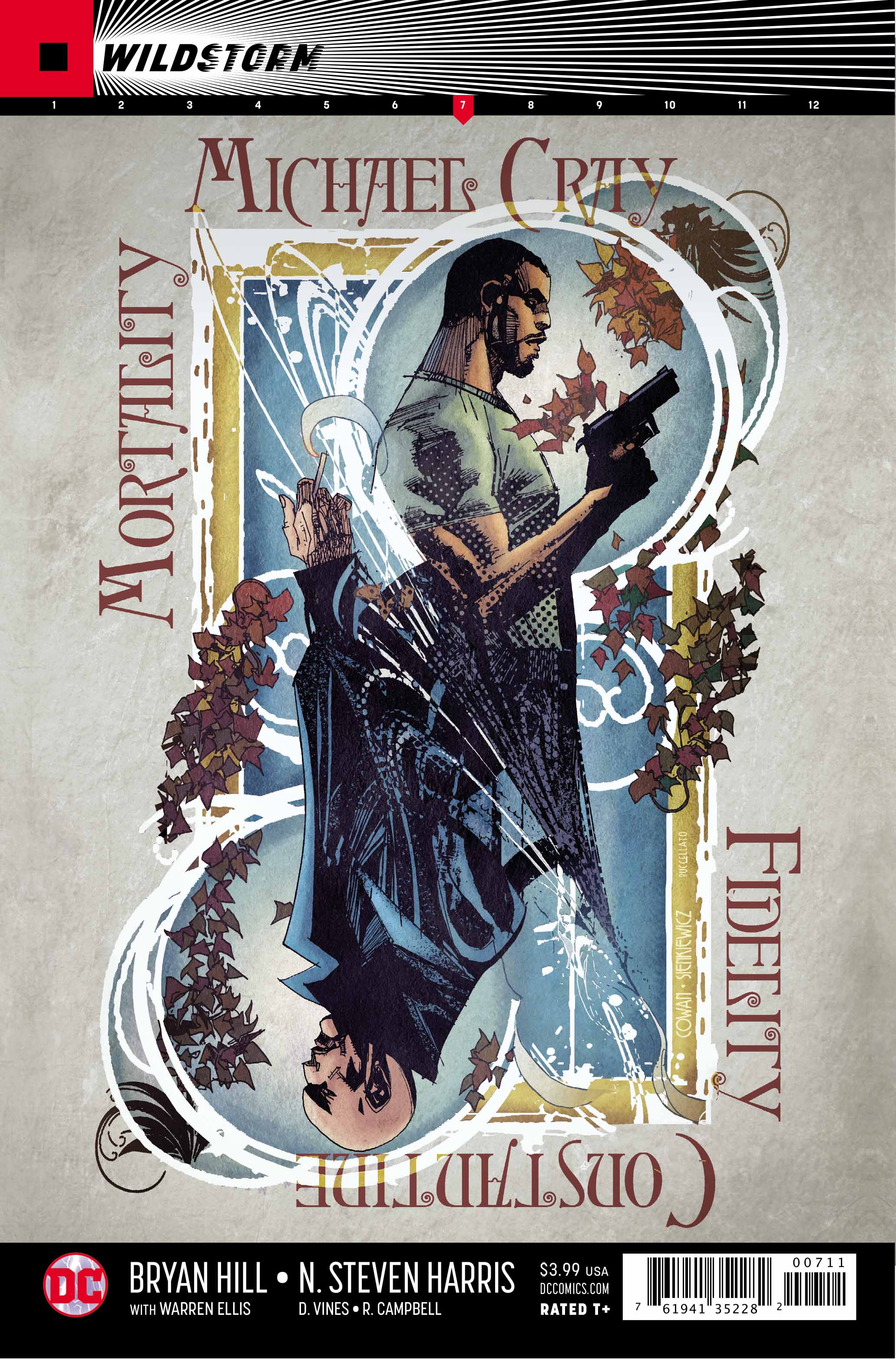
Writer: Bryan Hill
Artists: N. Steven Harris, Dexter Vines, Ross Campbell
Summary
Another issue, another mission for Michael Cray. This time he’s tasked with taking out the occultist Dr. John Constantine. By far the most cunning target yet, Cray will have to use more than just his strength and agility if he is to survive this encounter.
Positives
Without question this is the best looking issue of the series so far. It’s uncertain whether it is the inks from Vines or the colors from Campbell but the whole issue just looks significantly better than all previous issues. That’s not to say the art is fantastic yet, but it will certainly go a long way to help with readers who may have struggled with the series so far as a result of the artwork. What can be said is that the colors (while muted) are noticeably more interesting than they have been. Campbell does a respectable job of making everything look more real and three dimensional whereas pages had previously been flat.
Beyond the artwork the script by Hill also shows improvement. While the series has been enjoyable, the formulaic structure of two-part stories featuring Cray taking on a popular DC hero has been getting a bit stale. Readers saw it partly in last month’s issue but it’s ever more present here that Hill is adapting the structure of the series. Stories are becoming more interwoven with one another and less predictable. Out of all the possible heroes Constantine is definitely an appropriate choice to usher in this new style. Without delving into spoilers, there’s more than a couple of surprises in this issue.
Constantine is bald just as all other characters in this series have had slight aesthetic changes from how readers would recognize them usually within the DC Universe. It’s hard to tell if it was intentional or not, but this look makes him eerily similar to DC writer and occultist Grant Morrison. Specifically in a scene where Constantine shaves, the way his towel wraps around his neck looks suspiciously like old Morrison promotional photos. If it was intentional then it’s amusing and adds to the issue, if not it’s still a happy accident. Although making a character like Constantine look like Grant Morrison seems way more than a coincidence.

Negatives
There really isn’t much wrong here. As said earlier the artwork has made a vast improvement. At times the faces still fall under the same problems that have plagued earlier issues. In one scene that sees Michael Cray looking in a mirror, his features look as if they were placed on his face with one eye shut. This issue has been so consistent that it’s maybe time to just consider it the ‘style’ of the series. But the fact that the inking and coloring go to such lengths to cover it would suggest that it is just a slight problem on the art side from N. Steven Harris. This is the only real problem within the issue.
Verdict
Bryan Hill and N. Steven Harris deliver another fantastic issue in a series that is consistently good. This month Dexter Vines and Ross Campbell help the artwork dramatically making this issue the best looking in the series so far. Every month seems to improve on the last and issue seven is no exception. Readers should look out for where this series goes next.
