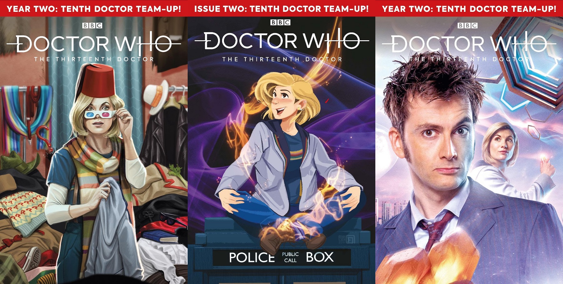
Review: Doctor Who – The 13th Doctor #2.2

 Writer: Jody Houser
Artist: Roberta Ingranata
Color Artist: Enrica Angiolini with Shari Chankamma
Letterers: Richard Starkings and Comicraft’s Sarah Hendrick
Reviewed by: Steve J. Ray
Summary
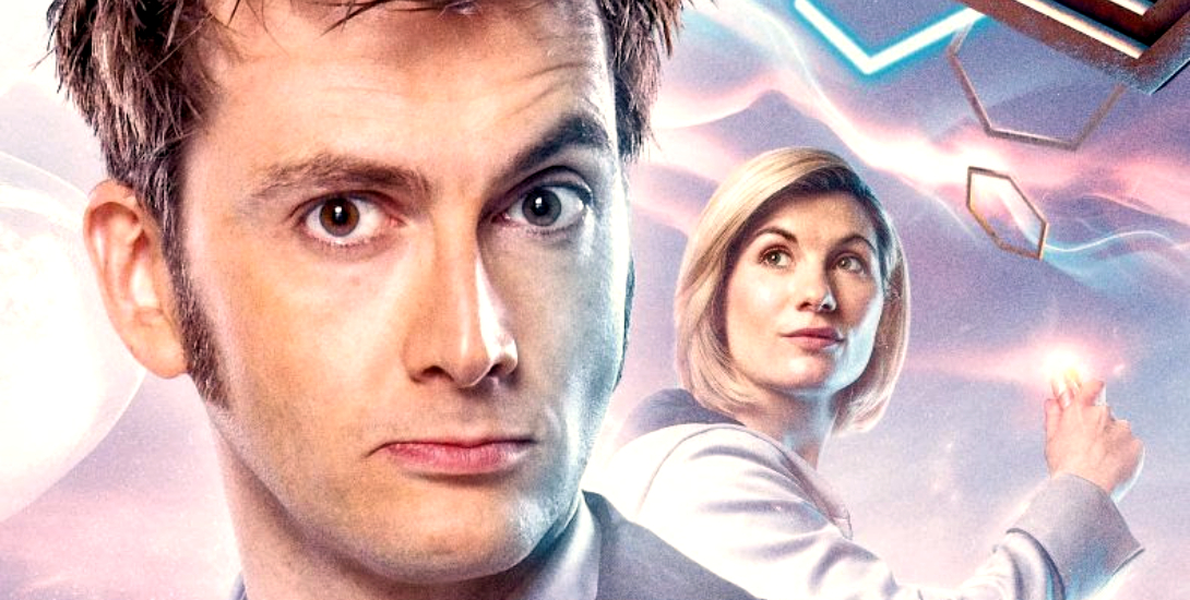
Doctor Who – The 13th Doctor #2.2 sets the cats amongst the pigeons, and the Doctors amongst the Weeping Angels. After arriving in 1969, where the Doctor’s 10th incarnation and companion Martha Jones were stranded in the brilliant TV episode “Blink”, the current Doctor and her TARDIS “fam” are neck deep in a missing persons mystery, and wondering why their wondrous time ship dragged them back to a potentially Paradox inducing moment in time.
Positives
An entertaining story, terrific dialogue and simple, yet incredibly effective art. What more could a comics fan ask for? Writer Jody Houser is one of the few American writers who can write British characters without them sounding like Dick Van Dyke from Mary Poppins or – shudder – Keanu Reeves in Bram Stoker’s Dracula. Her conversations aren’t stilted; they’re smooth and totally natural. I actually hear Jodie Whittaker and David Tennant’s voices when Ten and Thirteen speak, which is an absolute joy.
Roberta Ingranata’s work on this series always makes me smile. I’ve been reading Doctor Who comics for well over forty years, and hers are some of the best looking ever. Of course, the wonderful colors by Enrica Angiolini and Shari Chankamma help. Look below to see what I’m talking about.

The great use of high contrast light and shadow in the TARDIS scene, and the strong, yellow artificial lighting works brilliantly, particularly when compared to the outdoor scenes that follow. It’s brilliant seeing the line and color artists really making each other’s work truly shine.
I also love the way Roberta’s use of body language conveys so much emotion. The way the Doctor’s wringing her hands in the TARDIS, replete with excitement at the adventure to come, is so endearing… and so Jodie Whittaker.
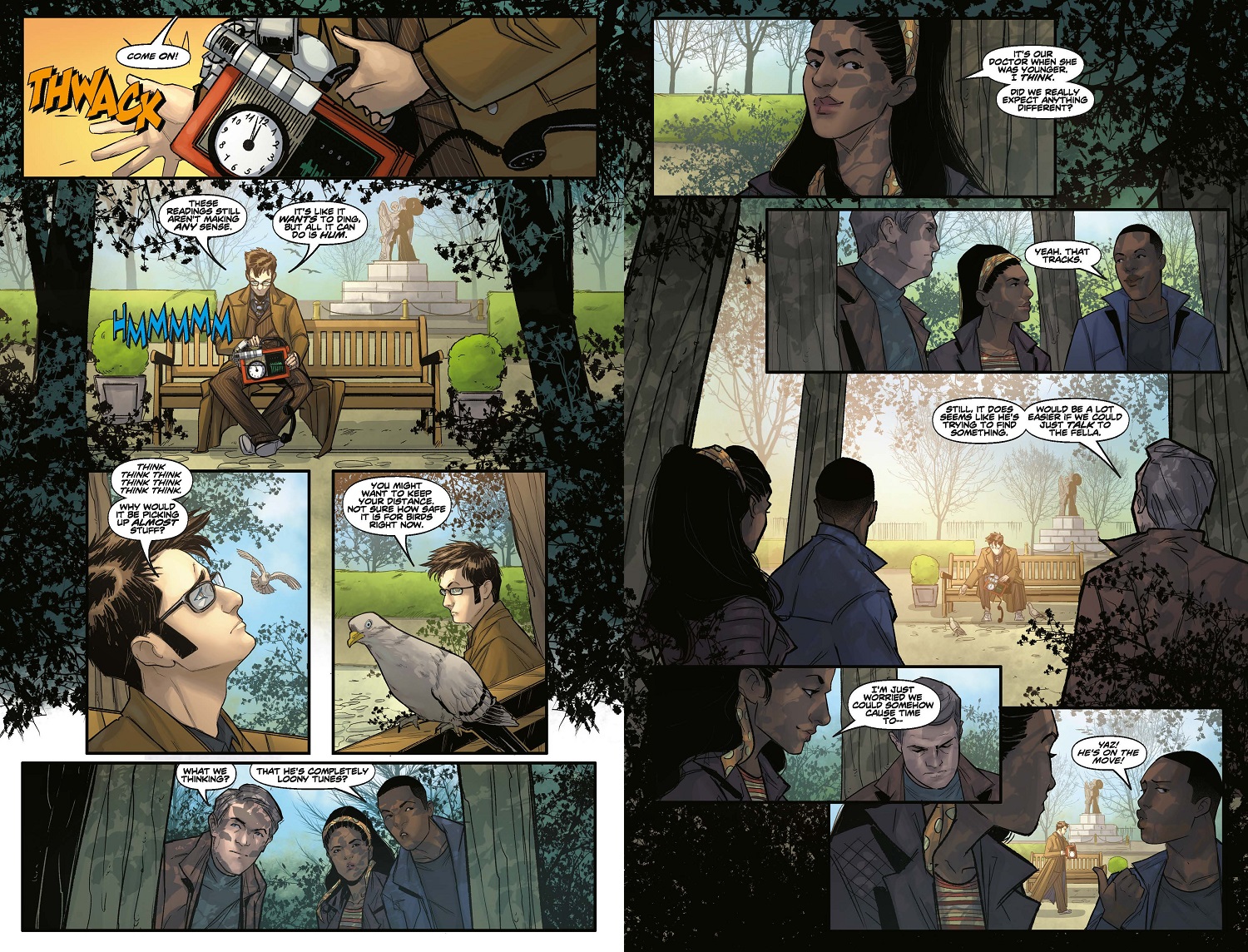
Look also at how every leaf is drawn, and every shadow of every leaf is colored on the characters faces. Was this necessary? No. Does it look great and add so much more depth to the scene? Hell, yes!
Then we get the sound effects and words on the page, so brilliantly applied by Comicraft’s Richard Starkings and Sarah Hendrick. Some letterers use the same fonts and styles for every sound effect, but look at the chunky, clunky “THWACK” compared to the thin and reedy “HMMMMM”… you can feel these sounds as well as hear them. Brilliant.
Negatives
You’re really asking the wrong reviewer and reading the wrong comic. If I have one, small criticism it’s that some pages have way too much negative white space between panels. I far prefer full pages like 1, 4 and 5, over the stark, clinically laid out pages 2 and 3… but that’s just personal taste.
Verdict
Introductions are made and paths are irrevocably crossed in this issue, which makes Doctor Who – The 13th Doctor #2.2 a great read. When you get terrific characters in brilliant, fun settings the final package is a real treat. Seeing my home town on the comics page doesn’t hurt either.
This new year has started off strong, and that cliffhanger has me wide-eyed in anticipation for issue #3.

Images Courtesy of Titan Comics