Artist Profile: Kenneth Rocafort by Peter Gaudioso.
Artist Kenneth Rocafort
Penciller, inker, and colorist, Puerto Rican artist Kenneth Rocafort is an industry triple threat! Keep your heads down as we traverse a superhero battlefield and examine some deadly artistic skills.
Social Distancing, People!
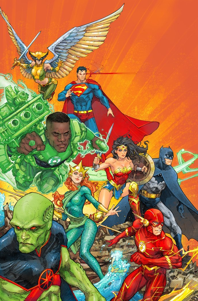
Kenneth Rocafort has a habit of combining wide open spaces with explosive pockets of congestion. Our attention can’t help but rebound off the flat, uninteresting background and land on our vibrant, youthful heroes. Even further, KR then makes our eyes squint to take in all of the fine details on Green Lantern’s weaponry.
Motion Sickness
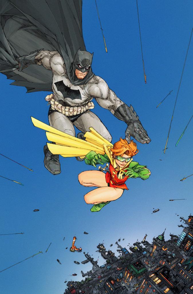
Disorienting, isn’t it? This is nothing compared to another image coming up later in the Rocafort tour. But don’t speed ahead. Let’s notice how – with a very minimal assortment of subjects – KR delivers a clear and exciting message. In this unofficial homage to Frank Miller, a slightly shifted horizon line and a few arrows of implied movement are all that it takes to create a little vertigo. At first glance I couldn’t tell which way was up for the buildings far below! Is that the sky or a body of water?
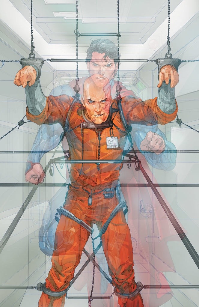
Tricks Of The Trade
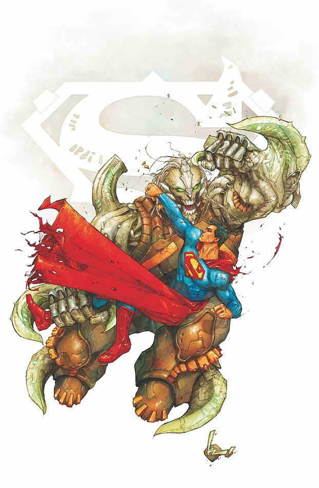
A slightly different spatial illusion – but the artist’s style is consistent. KR continues his tendency to use a drastic division between empty space and detailed subjects. Similar to our first example, the real fun begins once focus on the minutia. The tricky little blending points where Lex Luthor merges with Superman. Compositionally this piece asks: Who is the true prisoner? Is this foreshadowing a plot point? The ability to present a question with an image is a valued skill for any cover artist.
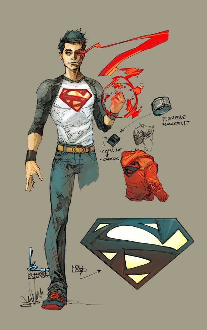
Pick Your Poison
Now we come to a different identity in Kenneth Rocafort’s artistic personality. This stylized concept sketch is a bit more like a preproduction idea. Nonetheless, KR sells it. Don’t you want to learn more about this character? I feel like I’m being invited into a video game. I want to grab the game controller and choose what gadgets to outfit Superboy with. When an artist gets his audience involved, the imagery becomes visceral. We attach a part of ourselves to the imaginary and then we are hooked.
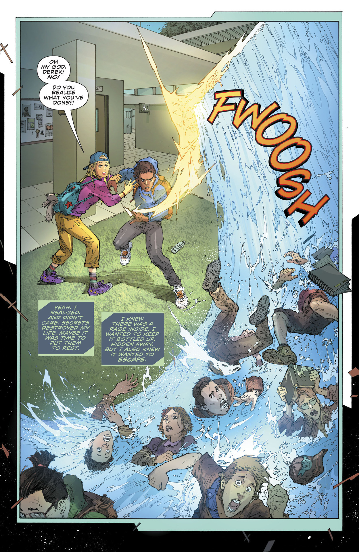
Wipeout!
This is the piece I teased earlier in regards to “disorienting.” Plucked from the limited space of a comic interior! Yet look how much information KR squeezes into the panel. You can actually feel the distance between the inside of the building out to the garden. Then the tidal wave bursts the frame open like 3D! Talk about a splash page! (Pun intended.)
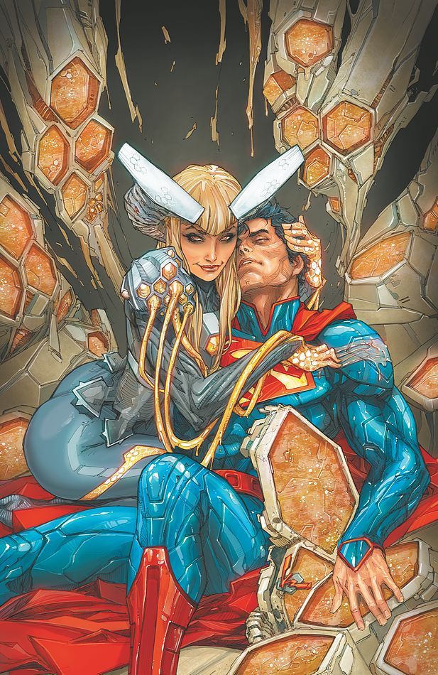
Breaking The Rules
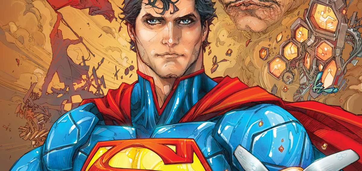
Now KR breaks his own rules and offers details aplenty. With very little blank space, instead, the alien technology is used to “frame” the subjects. The flawless perspective of the intertwined bodies is gorgeous. Superman’s bone structure and uniform are a maze of angles. Every segment of the liquidy armor fits into a perfectly contoured groove. Rocafort displays an expert control of lines – much like a mechanical drawing artist.
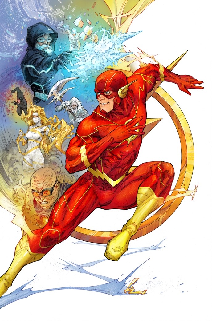
Movie Time!
One of my favorite things is when an artist creates a visual montage. Like a promotional poster for an Indiana_Jones film. Instead of a “literal” moment, we have a timeless emporium of our favorite chatacter’s history. This Flash cover includes villains, environment, and objects relevant to the story. All packed with suggestive symbolism and little glimpses into the action within the movie – ugh, I mean comic book.
I’m just gonna leave this beauty here unexamined. Bask in the brilliance. I hope you enjoyed this DC Comics News ARTIST PROFILE. Less biographical, this ongoing series focuses on composition, style, technique, and artistic personality.