Written by: Kelly Gaines
Reading comics is a layered experience. Often, the artwork draws us in, the storytelling brings us back, and the dialogue helps us to know our characters. We begin to imagine the way Superman would talk, or hear the Joker’s cackle in our mind as we become immersed in his latest scheme. Just as our experience as readers is multifaceted, it takes a village of talented creators to turn a story into a masterpiece. Pushing and pulling the narrative along is a distinct rhythm; you can find it in the words you instinctively emphasize when reading a character’s line, or in the seamless flow of narration guiding you from panel to panel. This rhythm is not happenstance, it is the product of carefully and painstakingly designed work by the comic book’s letterers.
Every word you see on the page is a decision, not just in the words the writer has chosen, but also in the way text is visually presented on the page. As such, the font, color, layout, and size of each word serve a purpose. These elements direct our eyes, making sure that emphasis is where it needs to be to keep the narrative moving. The letterer’s decisions give the words weight, setting the tone for each sequence. They help us hear the voices of characters clearly, in some cases creating visually distinctive formats for each character’s dialogue. The letterer’s role is a key (and criminally under-acknowledged) part of comic book storytelling. Luckily, DCN had the chance to ask some of comics’ best and brightest letterers about their experiences in the industry, what makes a well lettered comic, and what they wish readers knew about their work. Steve Wands, Deron Bennett, Tom Napolitano, DC Hopkins, and Clayton Cowles graciously shared their insights with us.
Steve Wands
Steve Wands is an artist, author, and veteran comic book letterer and colorist. You may recognize his work from Gotham Academy, Batman, and Batman Eternal (just to name a few), in addition to his work for BOOM! Studios, Image, and Kodansha Comics’ Attack on Titan.
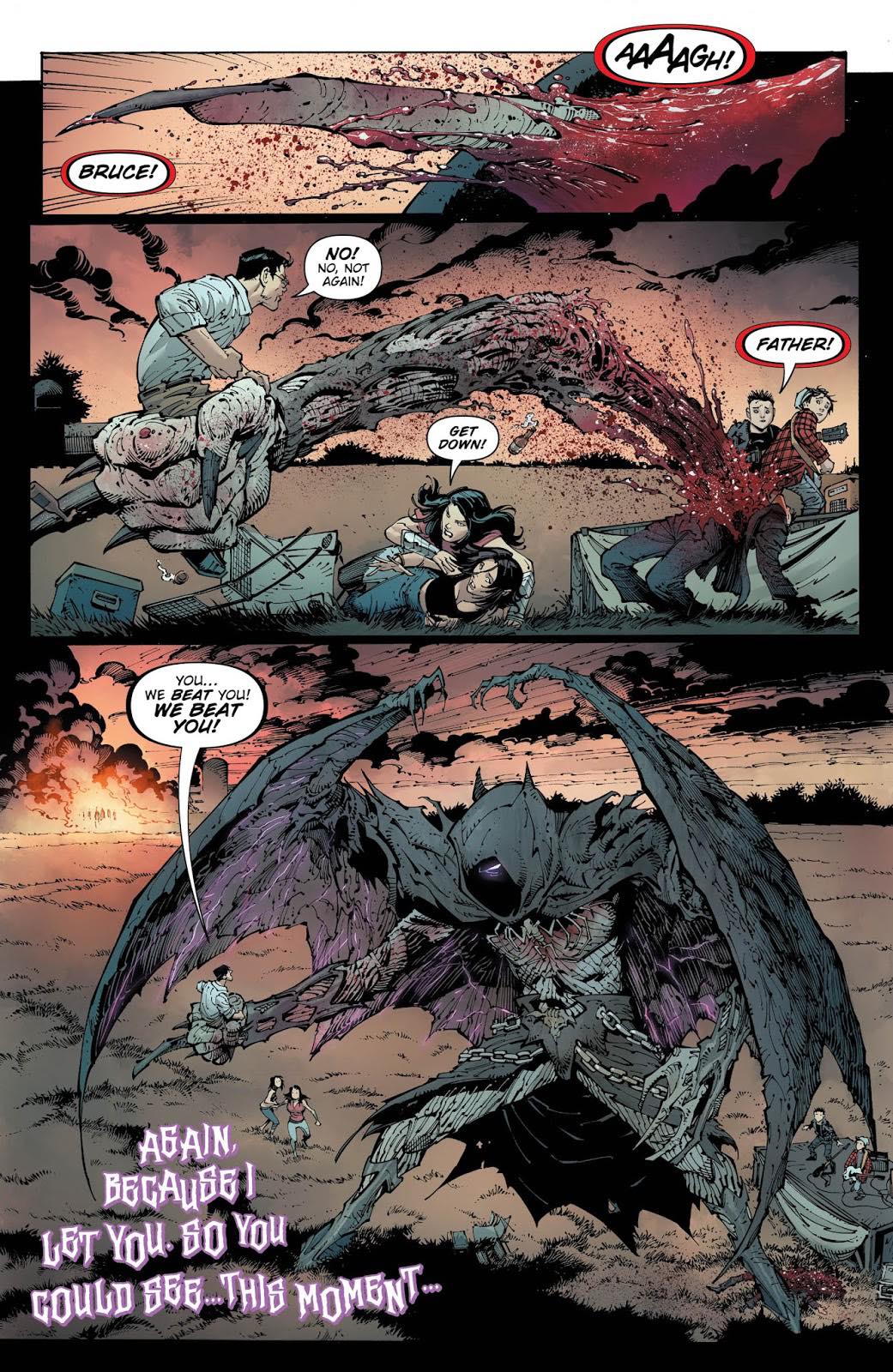
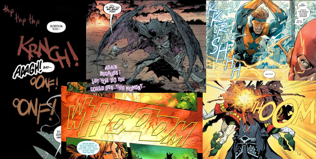
Dark Nights: Metal #3
What makes the art of lettering such an important part of comics?
Good lettering guides you across the page and through the story. It’s important–especially so if you’re not familiar with how to read comics–and along with guiding the reader, we can amplify an action with sound effects, or add gravity to words with bolding.
Why do you think people overlook this important aspect?
Because it’s intrinsic. People go to the movies expecting sound. They pick up comics expecting to read them. We have to make sure they can.
What made you want to become a letterer?
I never wanted to become a letterer, it was something I had an opportunity for and that I jumped at. I initially saw it as a stepping stone to other work, but quickly found that I loved it and was pretty good at it. One of the things I love about it is the variety of stories I get to work on.
How do you personally use lettering to enhance what’s happening on the page?
This answer would probably change if you were to ask me at different points in time. Lately I find myself looking at balance and flow. Where balloons sit on the page, how they interact with the artwork, how the tails flow, and if it can all work together in unison.
How much freedom in font style is there?
Really depends on the book and the publisher/editor. Some smaller operations will insist on a house style, others already know what font they want on a book, and others will seek you out to see what you think is best. Personally, I lose interest immediately if a book has a style predetermined for me, as most letterers probably do, but for someone just starting out, they might feel more comfortable on something with a house style.
How did you get into lettering?
I was always interested in typography, graffiti, design, and I read comics growing up so I knew comic book lettering was a thing. I went to the Kubert school and though I loved Hy Eisman as my lettering instructor, I had no love of hand lettering. I landed a gig with DC as a pre-press artist and from there I had a chance to interview for an in-house lettering spot that opened up. Got it, and I’ve been lettering ever since.
Do you have a voice in creating the font for a character?
Not often. Creating fonts is a long process for me. Most letterers don’t tend to create their own fonts for characters. It can take (me at least) several weeks to create a font and most editors can’t afford to give a letterer that much lead time. I’ve been able to do it a few times, most recently for Lucifer. I created his font inspired by Todd’s initial lettering on Sandman, but I had months of notice that I was going to be on the title.
What do you consider the best part of the lettering process; what’s the hardest?
The best part is getting to work with a variety of creators, editors, and publishers. I love the variety. The hardest is juggling the volume of work at the pace expected while trying to maintain a high degree of quality.
————————-
Deron Bennett
Deron Bennett has been nominated for a number of prestigious awards in the comic industry, including an Eisner Award, Ringo Award, Harvey Award, and GLAAD Award for Outstanding Comic Book. In addition to self-publishing his own independent comics (Quixote), Mr. Bennett owns the AndWorld Design lettering studio. You may also recognize his work from Far Sector, Telara Chronicles, and Batman Vol. 1 (2016), among others.
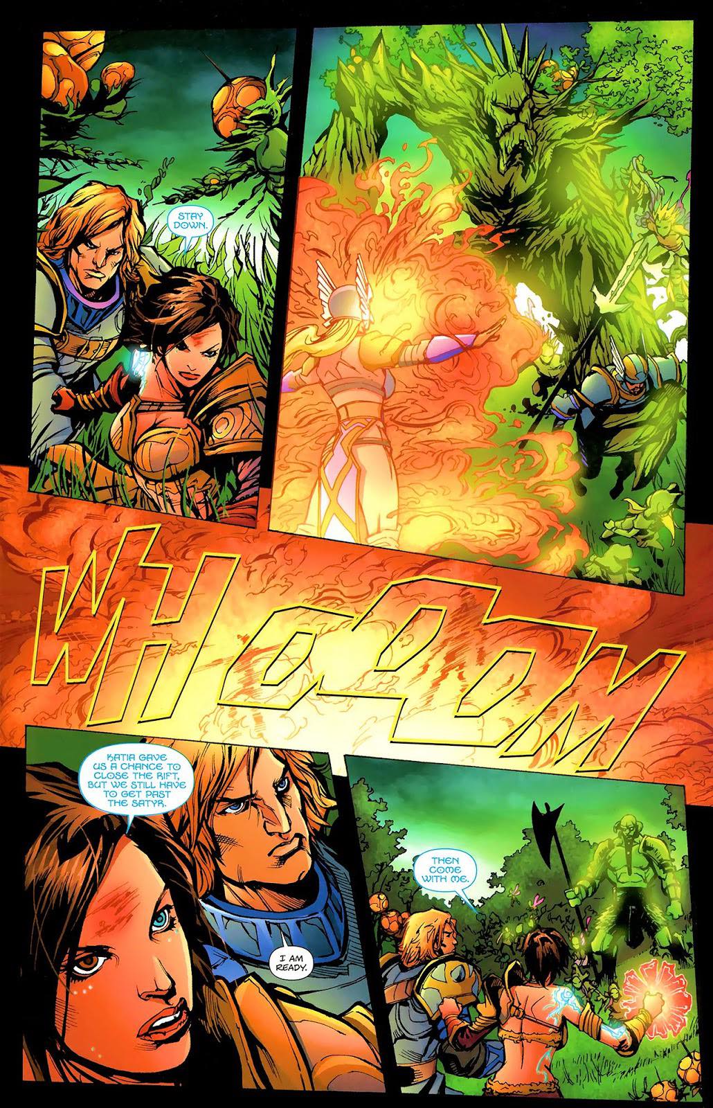
Telara Chronicles #0
What makes the art of letters such an important part of comics?
Comics is a visual medium, but there is also an innate audio component. The reader will automatically “hear” the talking characters, narration, and sound effects whenever immersed in a comic. It’s the art of lettering that makes that aural translation possible. And we do it in a way that is imaginative and well-integrated into the comic itself while remaining visually appealing.
Why do you think people overlook this important aspect?
The biggest reason is familiarity. It’s easy enough for people to know what a writer or artist does because they are familiar with those terms and what they do. I think it’s incumbent upon the industry as a whole, from creative teams to publishers to journalists, to help bring recognition to the art of lettering. The more we discuss the letterer’s role, the less it will be overlooked by peers and readers.
What made you want to become a letterer?
I love comics and typography. Easy choice.
How do you personally use lettering to enhance what’s happening on the page?
A lot of people look at the sound effects in lettering and focus on that. I look for ways to help tell the story. I use placement not only for guiding readers, as many people assume but for pacing and rhythm. I determine where I can play with volume, tone, or inflection and use visual cues to help get those elements across. We sometimes need to communicate visually challenging things, like simultaneous voices, language changes, or reality distortions. I try to give fresh takes on those concepts to help readers understand what’s going on in the 2D space.
How much freedom in font style is there?
With established books, you stick to what’s there. But for the most part, there is a good deal of freedom if the book is new. Early in my career, I would get a lot more feedback and direction on fonts to use. The more trust you build, the more people in charge will let you make choices without much input.
How did you get into lettering?
I was working at TOKYOPOP as a production artist, lettering manga. I got pretty good at it and started networking with people to do more mainstream stuff. The rest is history.
Do you have a voice in creating the font for a character?
There have been a few jobs where I’ve done font creation for books. Most notably, Tale of Sand. But for the most part, I stick to licensed fonts for publishers.
What do you consider the best part of the lettering process; what’s the hardest?
The best part of the lettering process for me is coming up with the style guide. Establishing the look of a comic is pretty satisfying, especially if it becomes the signature style of a book for years to come. The hardest part for me is probably keeping those styles unique from book to book.
————————-
Tom Napolitano
Tom Napolitano, another talented letterer out of the AndWorld Design Studio, has worked on some of the most iconic titles in recent DC history including Dark Nights: Death Metal, Batman: Last Knight on Earth, and Justice League. He’s done work for a variety of other publishers as well, including Vault Comics, Lion Forge Comics, and Humanoids.

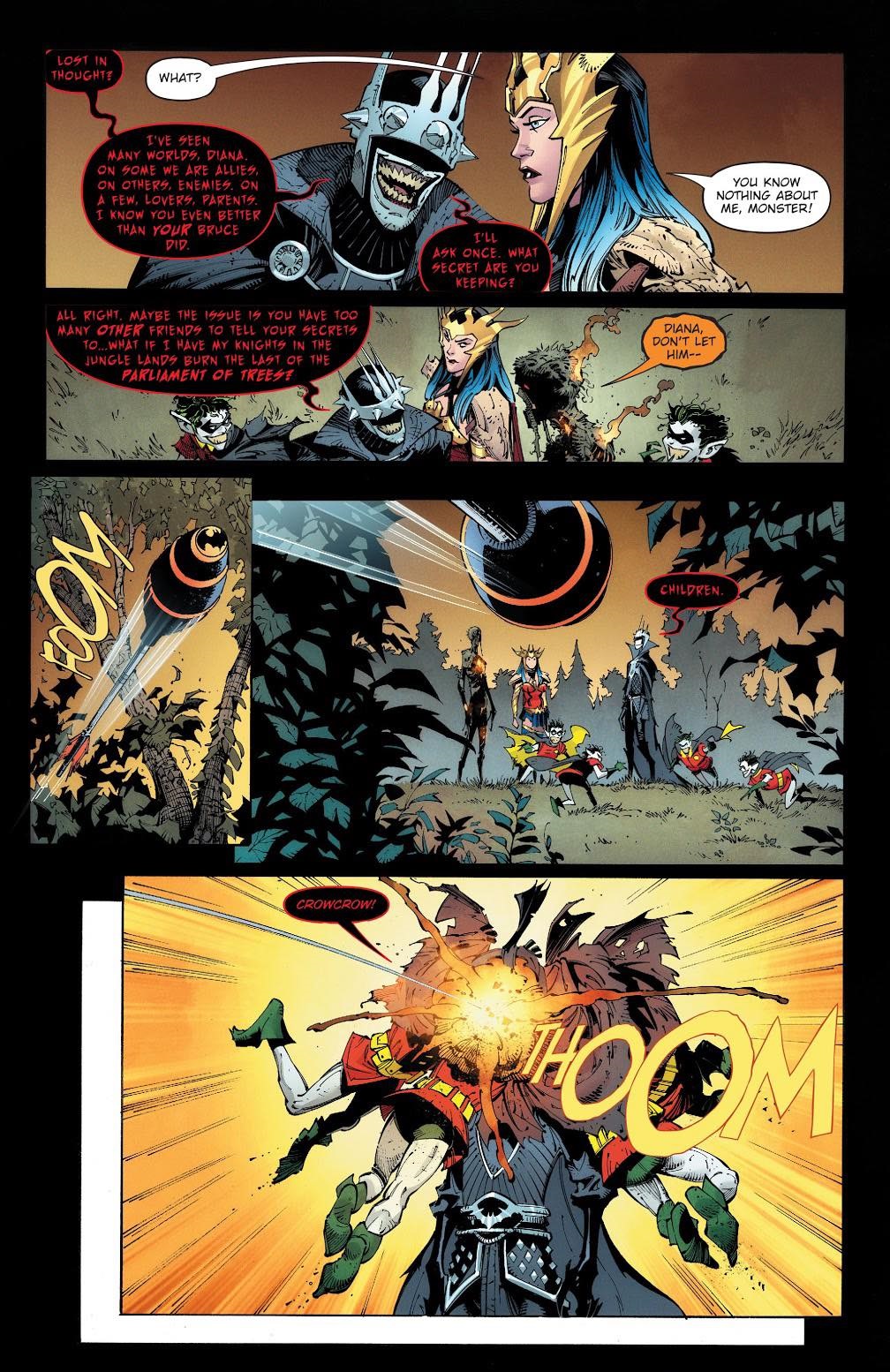
Dark Nights: Death Metal #1
What makes the art of letters such an important part of comics?
Its ability to be subtle. With lettering design, we aim to blend with the mood, style, and genre of the art and story. Achieving this blend helps the story manipulate the reader’s eyes while reading a page. But it also helps cue what the reader hears when voices and sounds break out of the blending; could be as simple as smaller type to hear a whisper, or drawing a wavy balloon to hear slurring etc.
Why do you think people overlook this important aspect?
Because the point is to be camouflaged within the art, hiding in plain sight until a moment in the story calls for a letterer to help exaggerate it. A kaboom will suddenly amplify a scene, but even the absence of lettering will make a somber moment that much more somber.
Dark Nights: Death Metal #1
How do you personally use lettering to enhance what’s happening on the page?
The point is to be camouflaged within the art, hiding in plain sight until a moment in the story calls for a letterer to help exaggerate it. A kaboom will suddenly amplify a scene, but even the absence of lettering will make a somber moment that much more somber.
How did you get into lettering?
Through a series of unfortunate events.
What do you consider the best part of the lettering process; what’s the hardest?
Title and credits are definitely the hardest.
————————-
DC Hopkins
Well-versed in the world of comics, DC Hopkins is a professional letterer and designer, also from AndWorld Design, who has worked for a multitude of publishers including DC, BOOM! Studios, Humanoids, Disney, Image, IDW, and Scout Comics– and that’s only scratching the surface! You may recognize his work from titles such as Steven Universe, Teen Titans, Darkwing Duck, and Accell (among many others).

Batman: Gotham Nights #13
What makes the art of letters such an important part of comics?
We’re a vital part of the reading experience AND the artistic experience. We convey the words of the writer and enhance the lines and colors of the artists.
Why do you think people overlook this important aspect?
A lack of recognition overall makes it tough. When you’re the only key part of the core creative team (not counting the editors who are, of course, extremely vital as well) that isn’t included in press releases, interviews, solicits, cover credits, etc. then it’s hard for most people to know you or your role exists.
What made you want to become a letterer?
The satisfaction of finalizing a page and seeing a finished comic book page in front of you. Problem-solving is a frequent component of the job which also keeps things fresh with new challenges happening almost every day.
How do you personally use lettering to enhance what’s happening on the page?
Sound effects are a big component of this, but the dialogue can (and should!) be as well. Make the words feel more vibrant on the page and the reader can feel the dialogue as opposed to just reading it.
How much freedom in font style is there?
It depends on the project and the publisher/creative team. Some characters have unique and consistent styles we have to stick with. New projects and new characters can bring new approaches and styles.
How did you get into lettering?
My interest in graphic design created an easy bridge to lettering and typography within comics.
Do you have a voice in creating the font for a character?
Definitely! Again, it depends on the project, but in most cases this falls to us.
What do you consider the best part of the lettering process, what’s the hardest?
Best part: when the page is done and you’re the last person to see the page before the reader gets to hold it in their hands.
The hardest part: time management can be tricky depending on how many things you’re working on at once.
————————-
Clayton Cowles
Clayton Cowles is an Eisner and Ringo nominated letterer, and Kubert School graduate. He’s worked with a number of the most well-known publishers in comics, including DC, Image, and Marvel. You may recognize his work from titles such as Batman, Star Wars, Bitch Planet, Bitter Root, and The Wicked + The Divine (to name a few).
Heroes in Crisis #5
What makes the art of letters such an important part of comics?
Without us, there would be no words.
Why do you think people overlook this important aspect?
In my case, it’s by design. My goal as a letterer is to go unnoticed, whether it’s by being flashy and dynamic, or quiet and subdued, depending on what the moment calls for. “Don’t be louder than the rest of the band, and don’t be quieter than the rest of the band.”
What made you want to become a letterer?
It began out of necessity. I went to the Joe Kubert School, intending to become an artist, and I did really well in my lettering courses. When I was staring down the barrel of impending graduation, I thought lettering was the more viable career choice for me. It seemed like a good networking opportunity, I had a few “ins” through some teachers and coworkers, and I wouldn’t be competing against my more refined classmates. But after a month or two on the job, I fell in love with the craft, and actively wanted to keep doing it.
How do you personally use lettering to enhance what’s happening on the page?
I enhance it by building on what’s already on the page (which I guess is the definition of “enhancement”). Sometimes I’m trying to match the style of the art and sometimes I’m leaning into the atmosphere of the writing. Whatever the job requires.
How much freedom in font style is there?
It depends on my position within the franchise. I was allowed to forge my own lettering style for Batman when I was first brought on, since it was the main title. But for spinoff titles like Superman: The Man of Tomorrow, I have to follow the styles established by other letterers in Superman and Action Comics.
What do you consider the best part of the lettering process, what’s the hardest?
The best part is forging a style. Trying different fonts and balloon shapes with different artists to see what fits, and collaborating with the rest of the team to nail it down. Some of the best ideas come from writers, artists, and editors.
The hardest part is the rewrites.
————————-
Comic book letterers have been crafting the rhythm of our favorite stories for decades, making it possible to feel fully immersed in stories about superpowers, aliens, ancient deities, and all manner of impossible things. Their work deserves to be recognized as the complex artform it is. The next time you pick up a comic and find yourself “hearing” the character’s voice, take note of the letterer. Without them, comics wouldn’t have the distinct voice and flow we’ve all come to depend on.