Artist Profile: Jim Lee
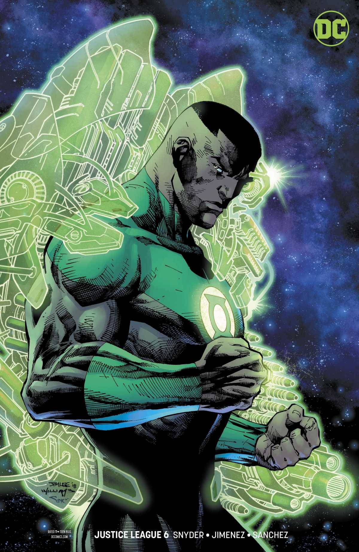
Jim Lee, born August 11, 1964, is a Korean American artist and Chief Creative Officer at DC Comics. Feast your eyes out on this visual buffet of pure pencil perfection and delicious dynamic movement.
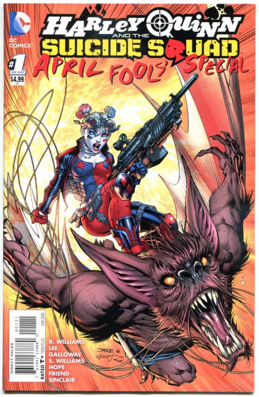
I’m Going Surfin’… I’m Going Surfin’
With sky surfing action like this, capturing perspective is a necessary skill for any comic book penciller. Lacking in this department will spell certain doom. Jim Lee thrives in shrinking anatomy from the foreground to the back. Although the monstrous Man-Bat dwarfs Harley Quinn in size, both characters are completely in proportion to themselves. It’s amazing how Jim Lee can craft the illusion of movement. Can you feel the trajectory of this charge as it advances from center-left to bottom-right? Add the chaos of that swirling rope to the wind-tunnel pencil strokes and this becomes a truly dizzying experience.
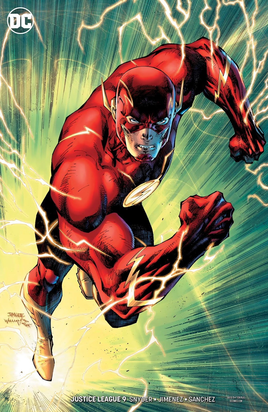
Big Time! I’m On My Way, I’m Making It
Any character Jim Lee illustrates instantly becomes larger than life. This explosive snapshot of The Scarlett Speedster is bonafide proof of that. Usually allot thinner, Jim took a risk by equipping The Flash with this classic, broad shouldered build. However, not applying too much muscle, JL effectively presents “superspeed” without the bulk. Again, Lee’s masterful control of perspective propells our hero like a lightning bolt. This illustration is electrifying, and demonstrates all of the things needed for the front covers of our A-List superheroes.
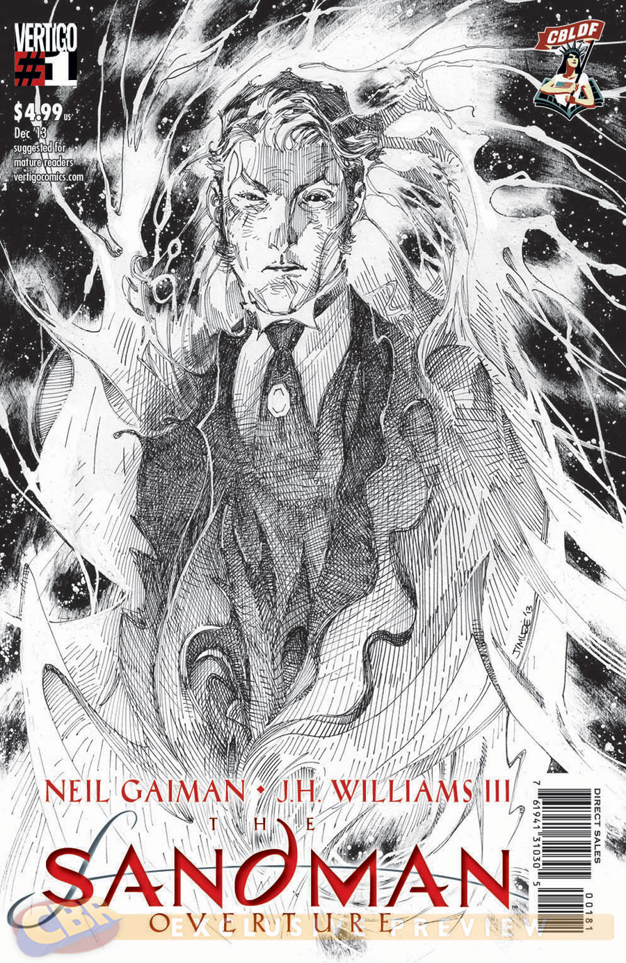
The Pen Is Mightier…
Jim Lee maintains an ongoing interactive tutorial where viewers can observe his step-by-step process. Jim Lee – How to draw Superhero Anatomy and Dynamic Figures Observe the cool and casual patience while producing this level of complex cross hatching. JL posseses an uncanny ability to create texture that you can actually feel. Focus in on those sticky magical webs. The suit jacket fabric that you can touch. I am continually amazed by the thousands of tiny lines used to create this immense range of shading. From the dark void behind, to the smoky grey wisps of eldritch energy, this piece is practically 3D!
Jim Lee variant cover
What Lies Beneath
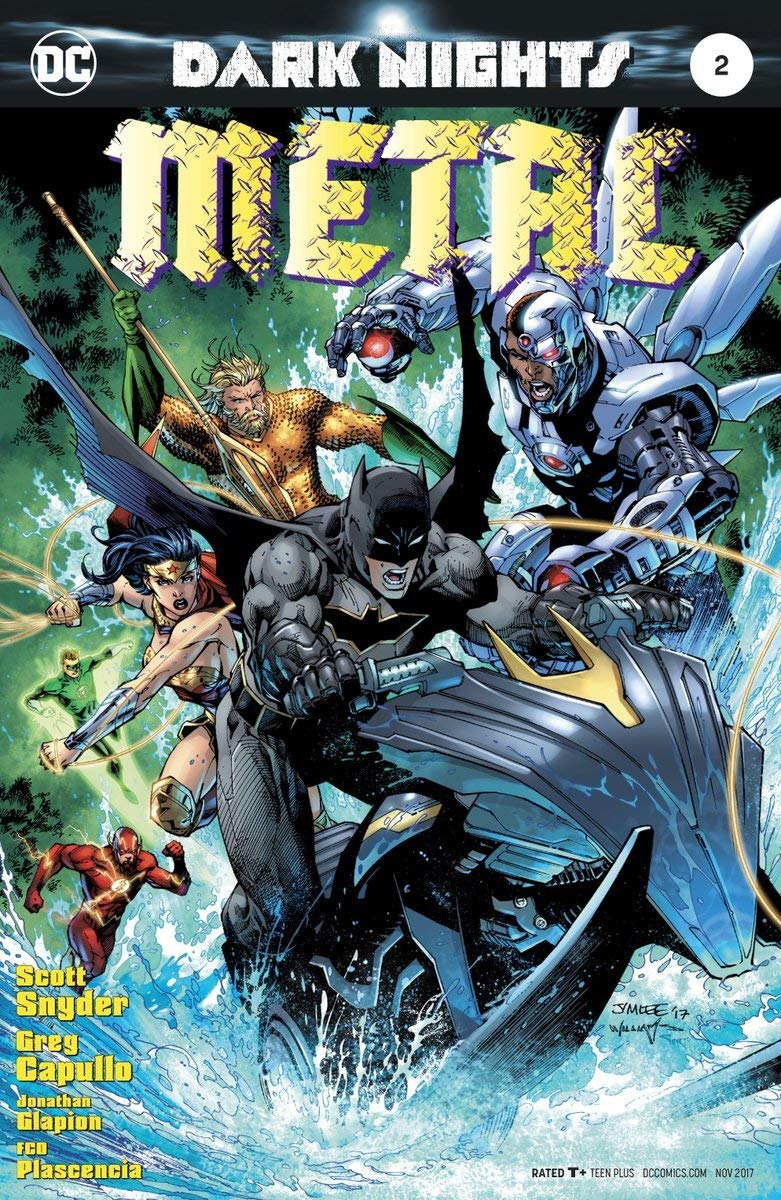
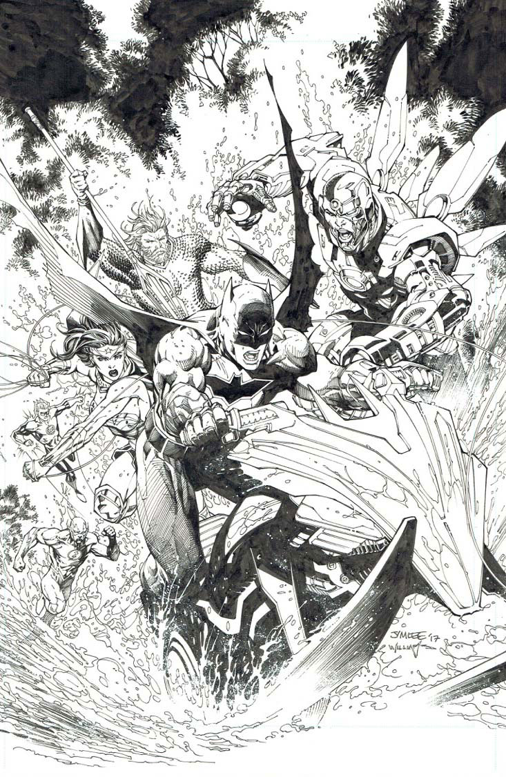
This Jim Lee variant cover for DARK NIGHTS: METAL #2 , (seen above, with and without color), really grants insight into the importance of a strong foundation. As you delve below the beautifully colored surface, try not to get lost in the subtle variations of texture given to the choppy waters. Or the delicate attention spent on the dark, fragile branches. And yet this crowded scene fits together like a puzzle, without the slightest sense of confusion. For all of the heroes competing for attention, Batman clearly makes the biggest splash.
Can you notice the continuing counter-clockwise movement? With the aid of the pointy Bat ski (bottom right,) we are lifted up to the clumsy Cyborg (top right.) Cyborg’s right arm pulls our eye to toward Aquaman – (back middle,) who seems to be having a difficult time staying afloat! From there, Wonder Woman punches our attention down to The Flash (bottom left.) Lastly, we surf the curve of the violent waves back up to centerpiece: Batman. Then the whirlwind starts up again! This genius composition keeps the viewer’s eye stuck on the page, and is the reason why Jim Lee is one of the most sought after cover artists in the business.
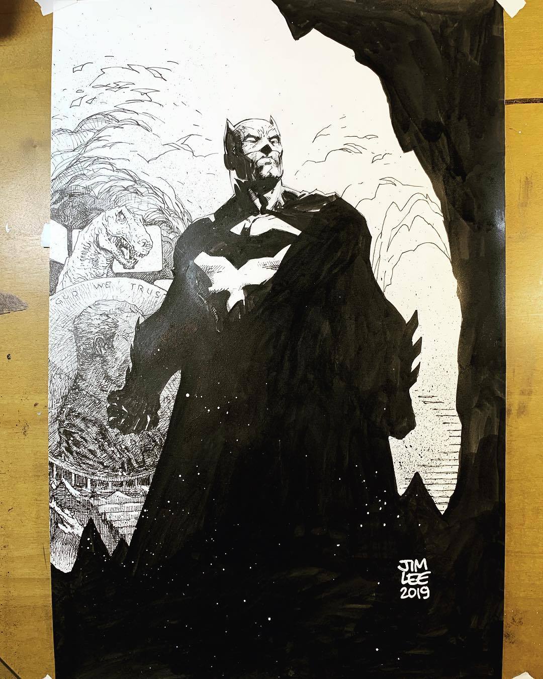
I’m going to leave this gorgeous, heavily inked mastepiece unspoken for. I hope you enjoy it. And I hope you had a pleasant stroll through these samples of the stellar excellence of Jim Lee.
Less biographical, this ongoing ARTIST PROFILE Series focuses more on style, technique, and personality. If there is an artist that you would like for me to feature, please mention so in the comments below.